Click here to access my Self Assesment form.
Click here to access my updated NLT2 form.
Click here to access my CV.
Click here to view the DegreePal brand guidelines.
Background
In my second year of university, I designed an app for the 2018/19 RSA awards to help students better cope with anxiety. For my third year's final project, I wanted to bring this idea further by redesigning the UI, creating a new brand and producing an intructional video for it. Additionally, I wanted to address more problems than just anxiety. From my own experience and the experience of my peers, university can be a struggle for a multitude of reasons and I wanted to address them.Brief
Design an app to help university students improve their experience at university. The outcome will require a brand identity, along with some brand guidelines. The app will also require an animated instructional video, demonstrating the problem DegreePal is addressing, as well as how to use DegreePal.
Software Used
Adobe Illustrator
Protopie
Adobe XD
Adobe After Effects
Adobe Audition
Adobe Premiere Pro
Adobe Indesign
Research
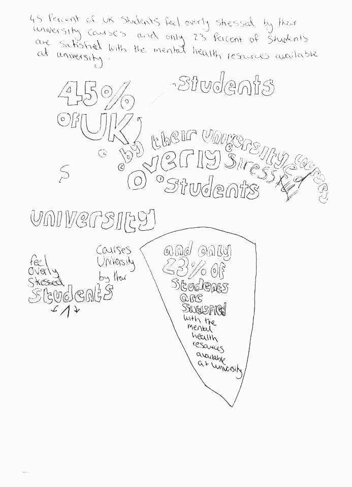
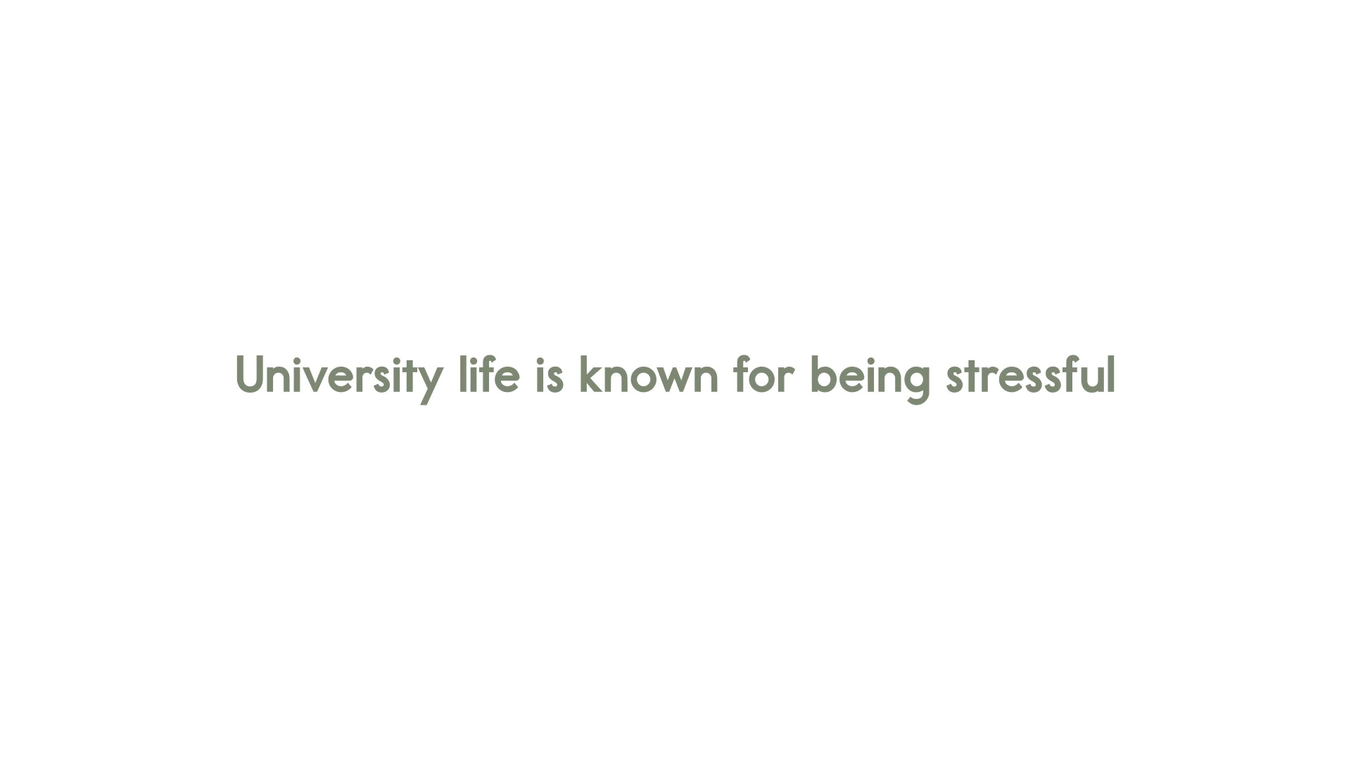
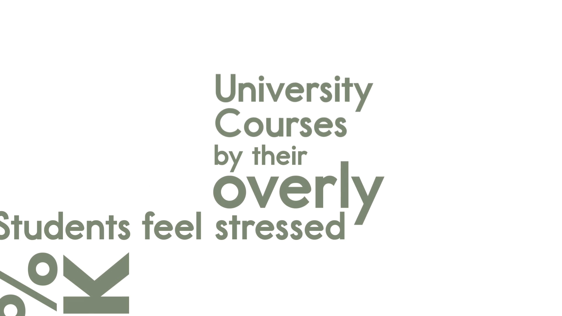
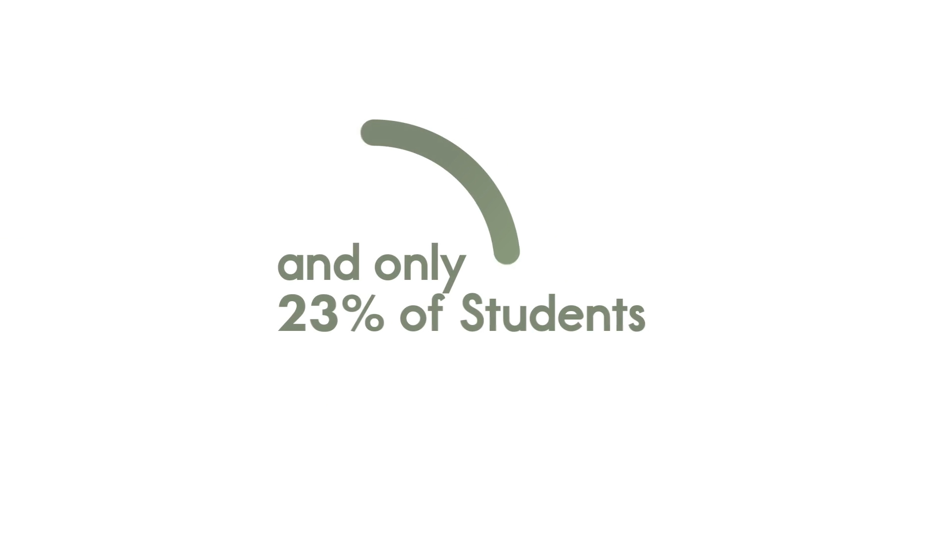
Mental health is a topic which has influenced me greatly throughout my life, so I wanted to ensure that the app I designed would actually be usable and effective in aiding students with mental health struggles. My research informed me that 45 percent of UK students feel stressed by their course. On top of this, only 23 percent of UK students are satisfied with the mental health resources available at their university. (Collier, 2019)
Survey
The next step in my research involved discovering the some of the contributing factors towards poor mental health at university. To do this, I created surveys and posted them on various university groups on Reddit. I also asked some of my friends at university to complete the survey.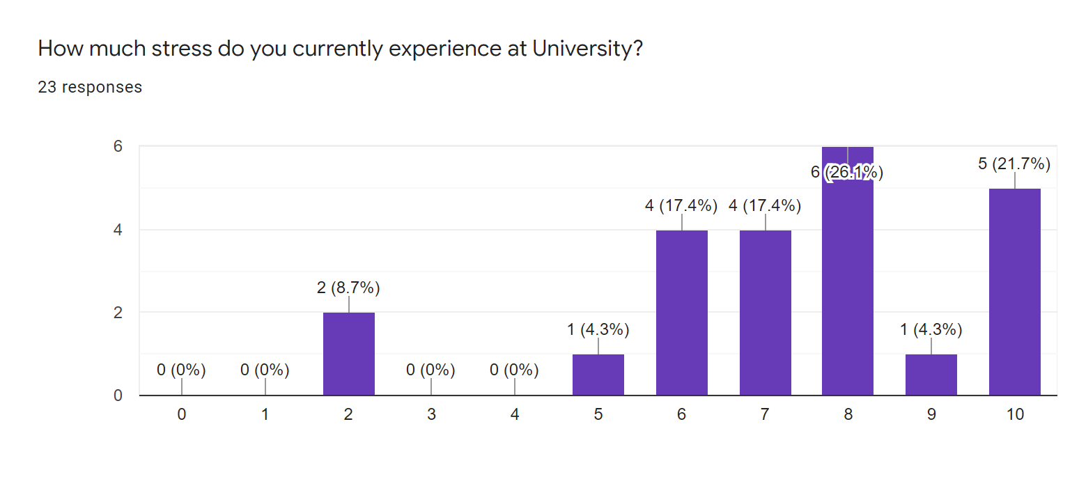
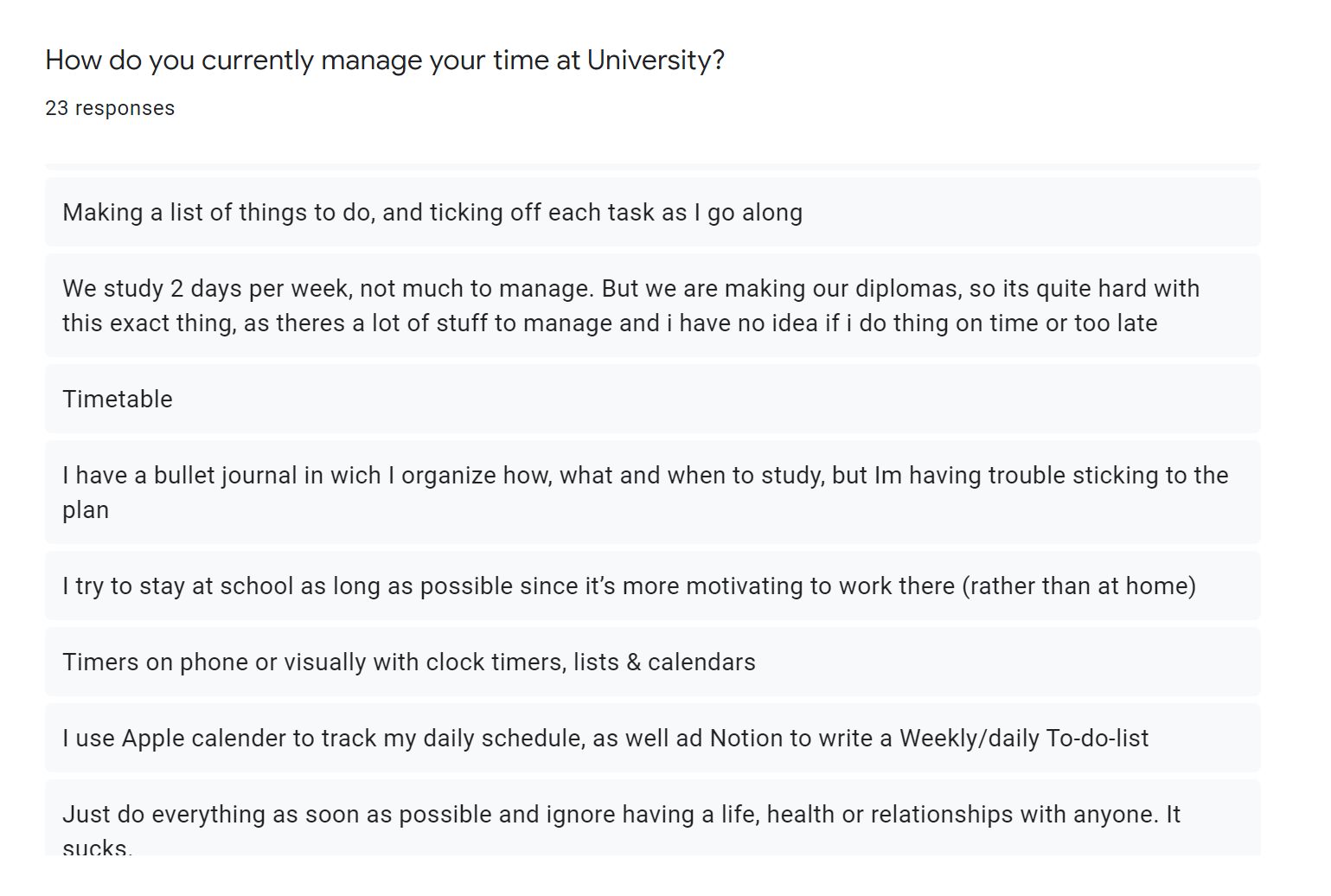
Extra Feedback


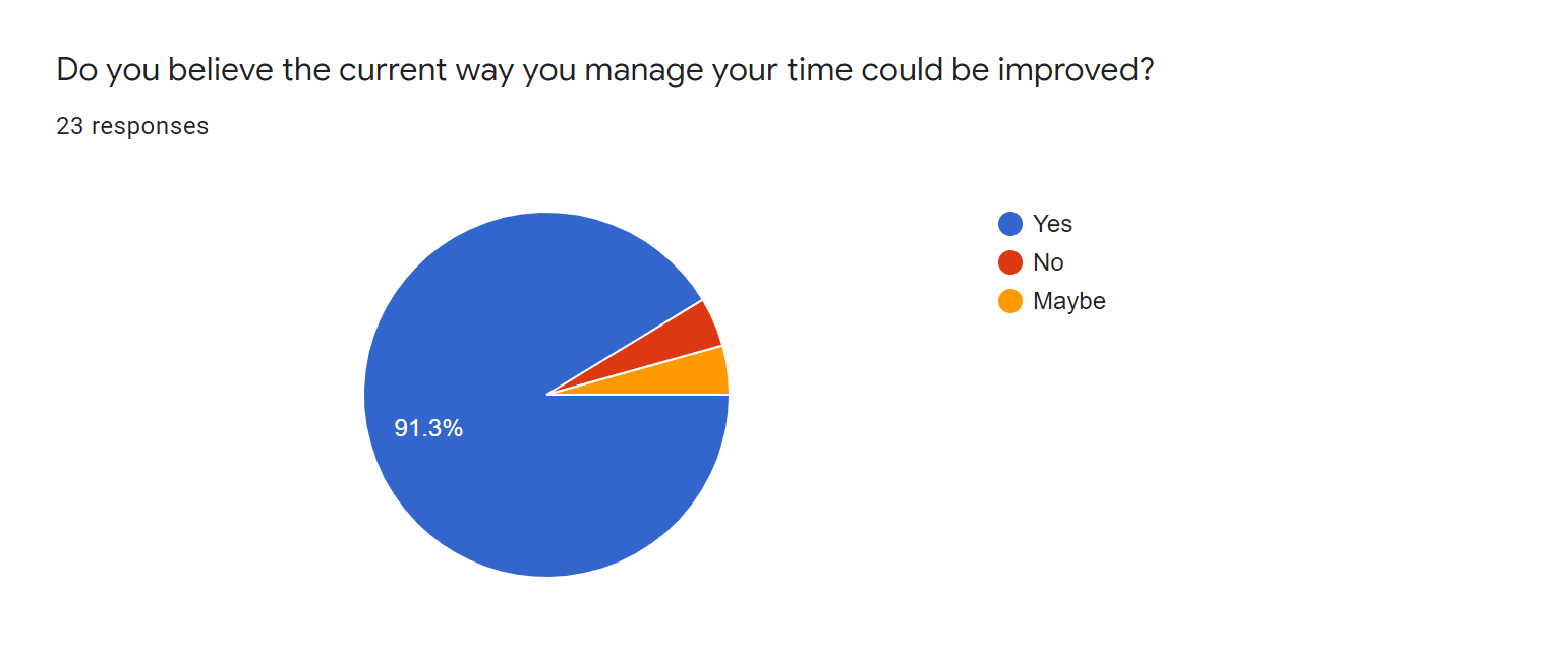
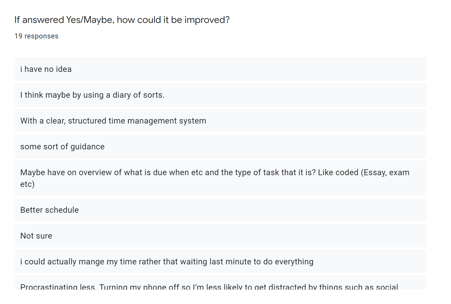
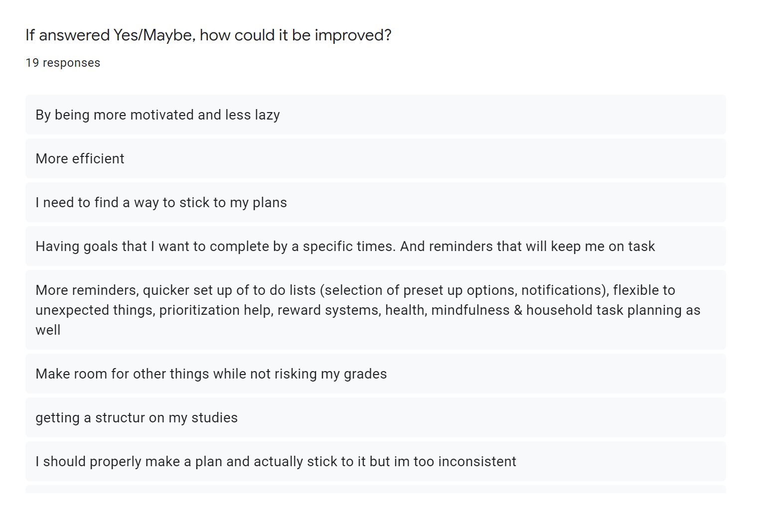
Survey Results
From the results of this survey, I surmised the following:
- Students experiencing high levels of stress at university is a regularity.
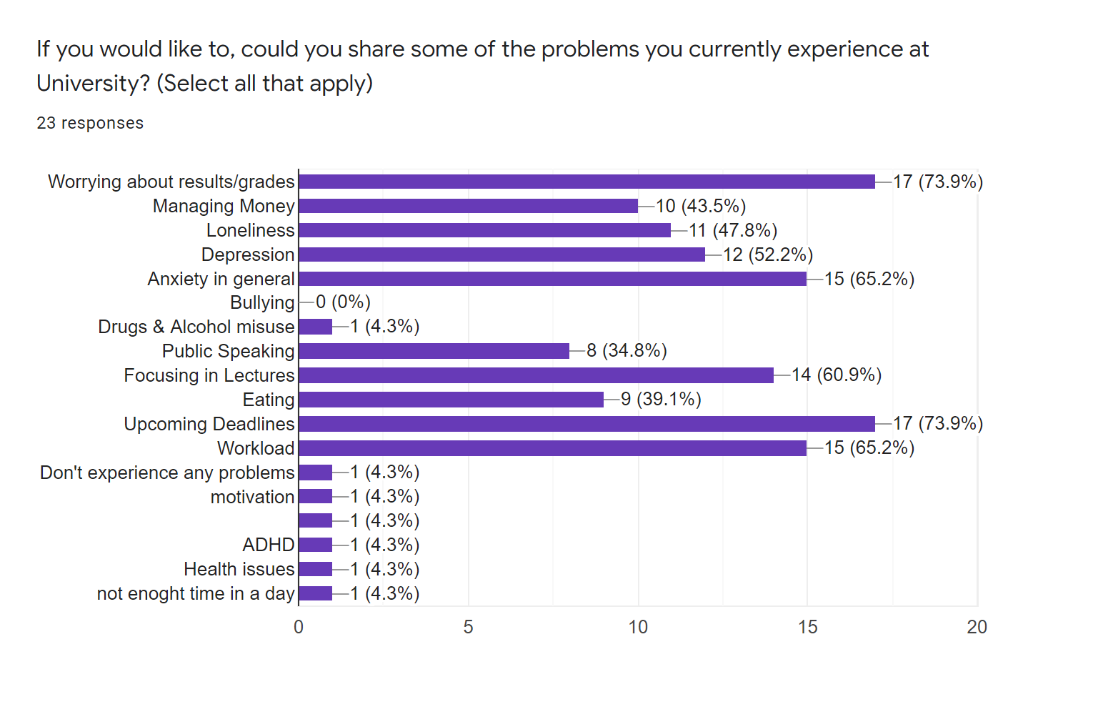
- Worrying about grades and upcoming deadlines are both among the highest causes of stress for students.
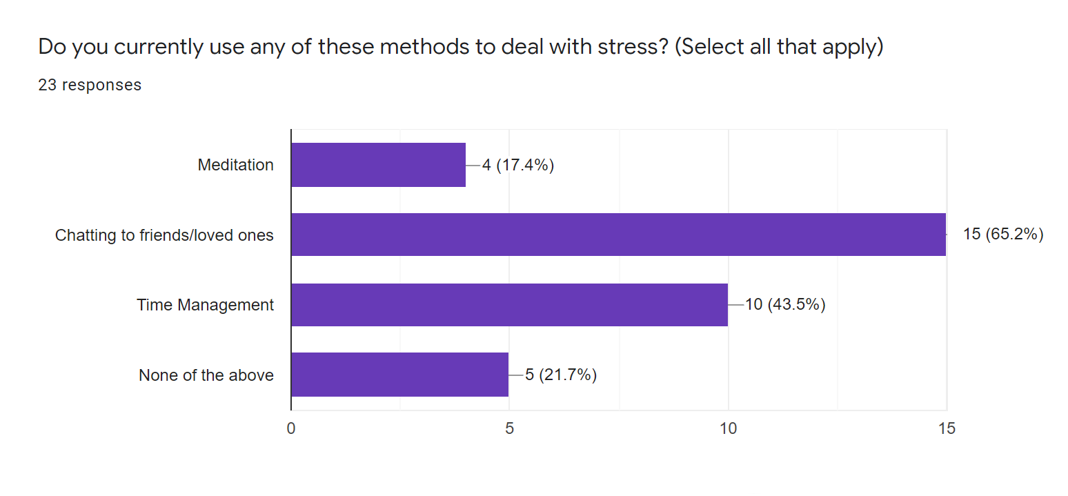
- Chatting to friends or loved ones was the most used method of relieving anxiety.
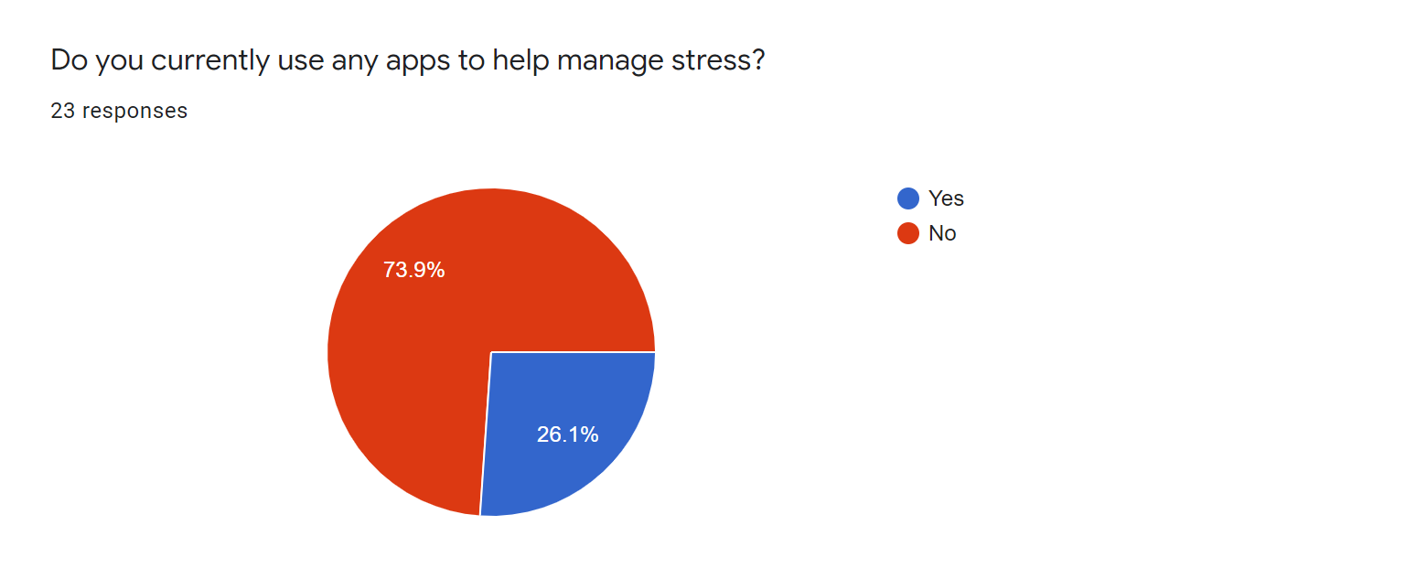
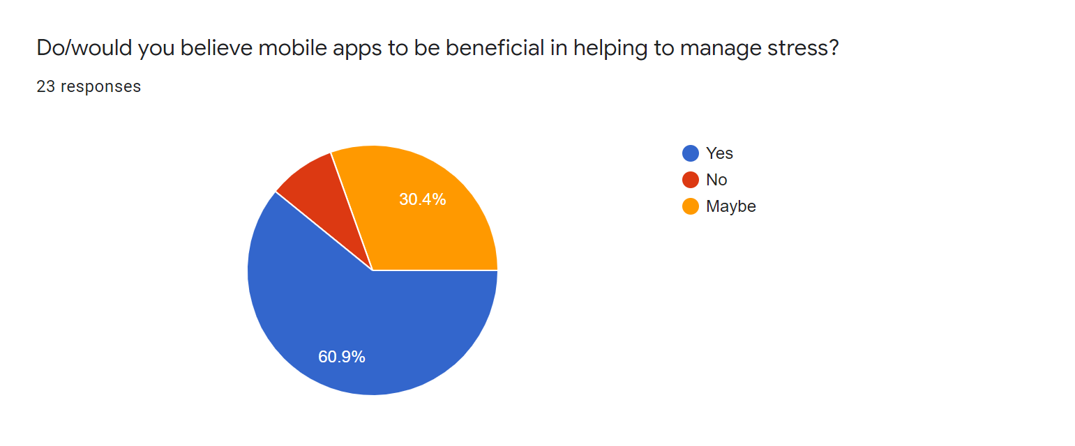
- A majority of participants have never used an app to help manage stress. On the other hand, 90% of particiapnts belived mobile apps to either be beneficial in managing stress, or potentially beneficial.
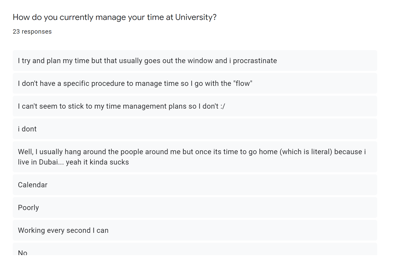
- Most of the participants found their time management techniques to be unsatisfactory and believed they could be improved.
- Some of the ways the participants believed their time management could be improved included the use of diaries, a clear and structured time management system, having an overview on what is due on upcoming days, reminders and mindfulness techniques.
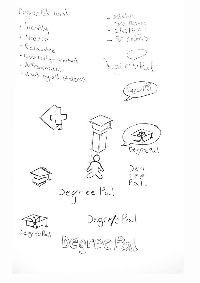
Desired Brand Identity
Before proceeding with the rest of the project, I set the following principles as the desired brand identity for DegreePal:
- Friendly
- Modern
- Relatable
- University-related
- Approachable
- Accessible for all students
These principles would provide me with a set of guidelines to follow during the following stages of this project.
UI/UX Research
Click here to view my UI/UX Behance moodboard.
With an initial impression of what I needed to include in my app, it was time to start looking at other successful apps to analyse how they use certain design principles to positively influence their user experience.
Headspace
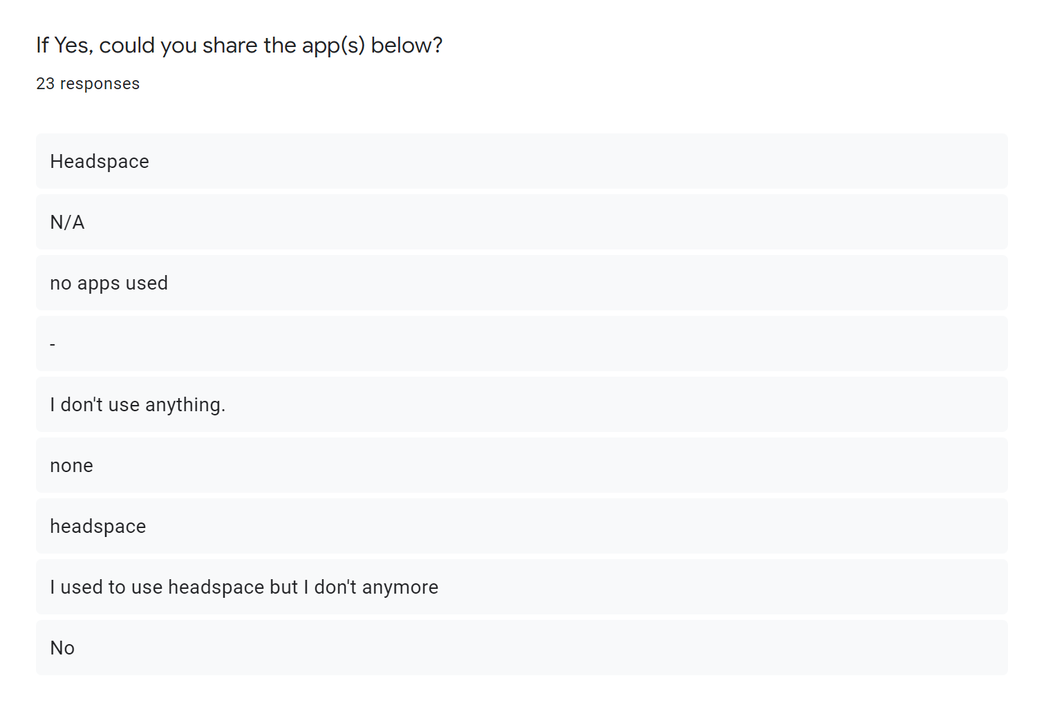
Headspace is a popular app which gives its users the ability to learn how to meditate, no matter where they are. The benefits of using Headspace range from improved levels of happiness to getting better sleep. This is an app I use personally to help with anxiety and it was also an app the participants of my survey said they used. The designers of Headspace's UI have made use of numerous design principles to guide its users through the app and simultaneously create a visually pleasing experience.
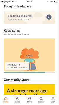
Headspace's UI makes use of Gestalt's figure-ground principle to highlight areas of the screen that can be interacted with. The use of contrasting colors creates the impression of a background and foreground. By using this principle, the designers have been able to create aesthetically pleasing buttons. This technique has been made more effective with the use of minimal screen content. Too much content on the screen would cause the UI to be harder to navigate and thus, more stressful for the user. The result of Headspace's minimalistic layout creates a clean and organised aesthetic, which synergises with Headspace's function; mindfulness and relaxation. To ensure that my app is also easily-navigated, I also used Gestalt's figure-ground principle.
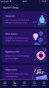
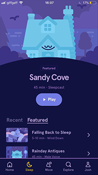
It's also evident that Headspace's designers extensively thought through the processes of their users whilst designing parts of the app. An example of this can be found within the sleep meditation section, where darker colors have been used to create the impression of night time and to also reduce the amount of blue light being emitted from the screen. This is important because when blue light is absorbed by light receptors, our brains delay the release of chemicals which cause us to become sleepy. This smart design decision further helps users of Headspace to wind-down whilst selecting a sleep meditation. This is a level of user experience research which inspired the design of my app.
Behance Project - 'App Light & Dark Version'
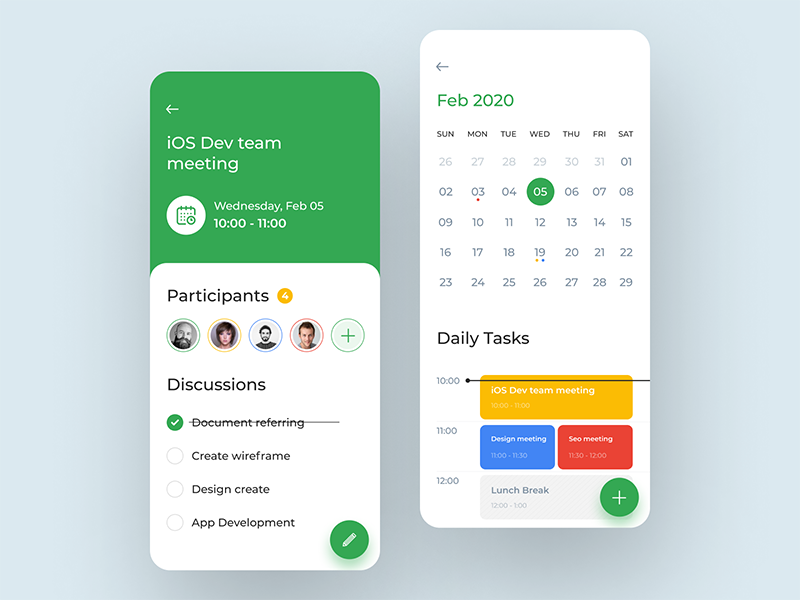
This is another app which inspired the design of my app. This app utilises single, flat colors for important features such as buttons. Gestalt's common region principle has also been used to create separation between the elements on the screen. Rounded rectangles have been used to create this effect, which has resulted in a clear and easy to navigate UI. I particularly liked the way the designer used the white rounded rectangle above a colored background, which demonstrates Gestalt's figure-ground principle. Another of Gestalt's principles, continuity, has been used here. The effect of this combination of principles is a UI which is appearingly multi-layered and extends from the bottom of the screen to the top. This gives the impression that these layers can be moved to change how information is displayed. This greatly inspired the design of my app.
Incorporating all of these principles into the design of my app ensured that the survey respondents who said they were missing a clear and structured time management system would have their requirements met.
Behance Project - 'Chat'
Because I wanted to include a chatting feature to my app, I wanted to research how other designers created chat menus and interfaces. This app adopts a layout for chat menus which has been used similarly across many other messaging apps, such as Facebook Messenger and Whatsapp. Whilst the basic layout is similar, this app adds it's own uniqueness with the addition of a shadowed tab. This part of the design creates distinction between the lower and upper part of the apps design in a visually appealing way. I used this well-known layout within the design of my own app, as using a structure users are familiar with will make for a smoother experience for users.
Behance Project - 'Sophie'
I also studied this app to gain inspiration for my app's messaging UI. This is another example of a designer using a layout which is familiar to many users, as this kind of messaging UI has been used across many mobile apps.
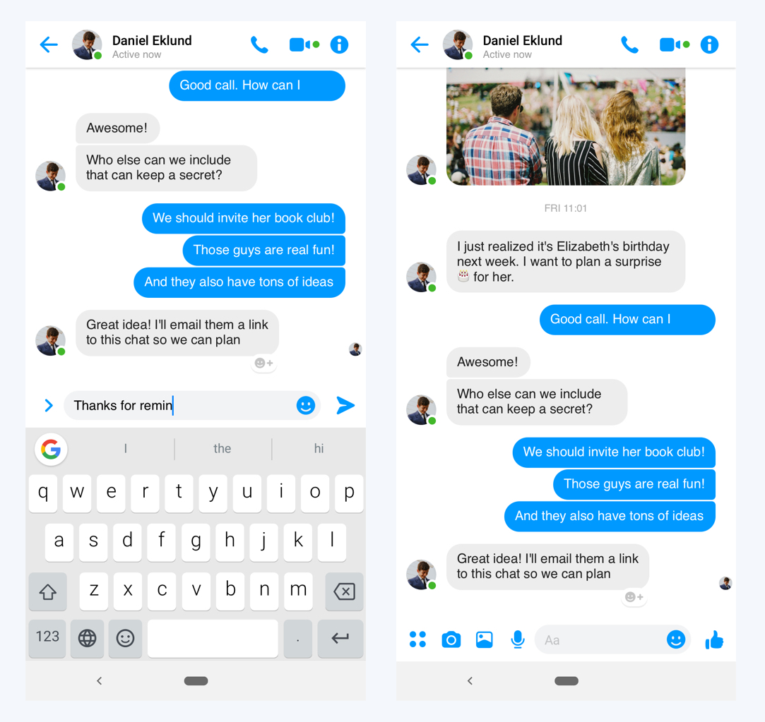
When comparing Sophie's UI with the UI of Facebook Messenger and Apple iMessage, the similarities become clearer. In all of the examples above, the text's 'speech bubble' resizes dependant on the size of the message contained. Additionally, all of the apps use a white background and white text, to ensure maximum readability. Facebook Messenger and Apple iMessage also give the user the option to switch to night mode, for a better user experience when the app is used at night. The elements which create differences between the apps consist mostly of the content at the UI's header and footer, with Apple also adding tails to iMessage's speech bubbles. These header and footers are where the UI designers have the space to give additional functionality to their user's chatting experience. For example, iMessage includes a video chat and a call option within its header, alongside an image of the message recipient. Within the footer, various other buttons are included. Sophie's design is a lot more simplified, which I believed was appropriate for the design of my app. This was due to the fact that I envisioned the chatting feature to be simple and to only allow users to send text-based messages to each other. Anything more than this could have drawn the user's attention away from the other important features of the app. The risk of this would be the users viewing the app as another socialising platform, which it is, but it was also important to address the other causes of stress for students, such as poor time management.
Logo Research
Click here to view my full logo moodboard on behance.
The next stage in my research process was to research some logos. I put a lot of importance into this part of the project, as the logo would be the first thing that people see when they load the app, or perhaps even see it advertised. A good logo would create the impression that the app is good, a bad one could perhaps dissuade people from downloading it in the first place.
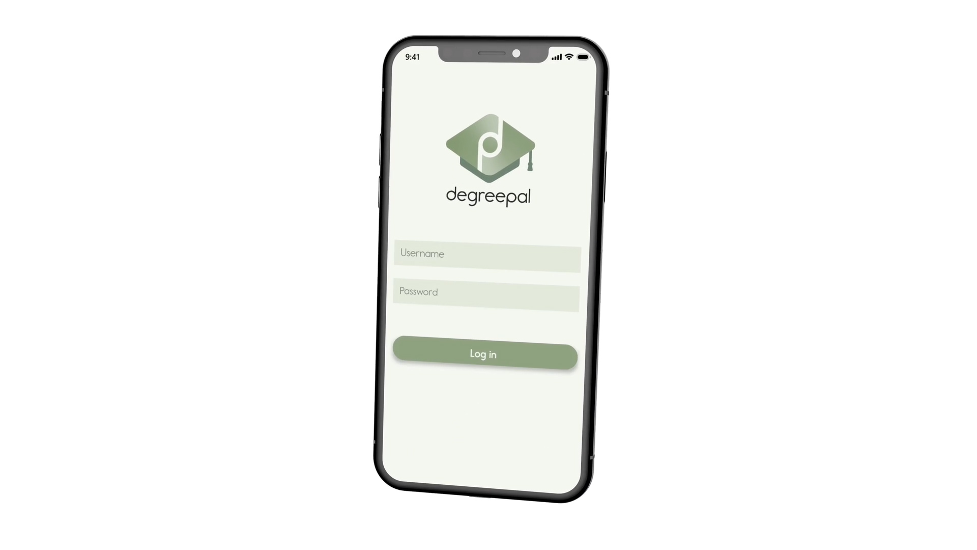
I started the logo research process off by looking at University-style logos. I did this because I decided it was essential that the logo I design for the app catches the attention of my target audience; university students. By doing this, I would be utilising Gestalt's 'Meaningfulness' principle, as the logo would be forming a personally relevant image to students. Prior to starting my logo research, I decided to name my app DegreePal. This name, when paired with the logo, will further inform people that the brand is representing a product for university students.


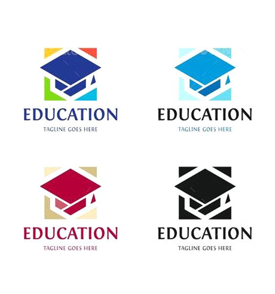

I particularly liked the logos above which feature the university mortarboard cap as the main element of the logo. This is because it's harder to tell what type of subject the logo is representing when the mortarboard cap isn't the most prominent item in the image. The 'Education' logo is the most aesthetically pleasing and attractive logo in my opinion, as it makes use of emphasis the best. This is because the designer has bordered the main mortarboard cap element with smaller elements, making use of Gestalt's 'law of closure' principle to create a square around the logo's main element.
The next stage of my logo research involved looking at examples of where hidden symbolism has been used in logos. After the decision that I wanted to include imagery that would relate to universities, such as motorboard caps, I wanted to explore if this could be accomplished with hidden symbolism. By adding hidden symbolism to the app's logo, I would be adding ambiguity to it, making it more interesting and well thought out. This kind of aesthetic would reflect on the app itself as well.
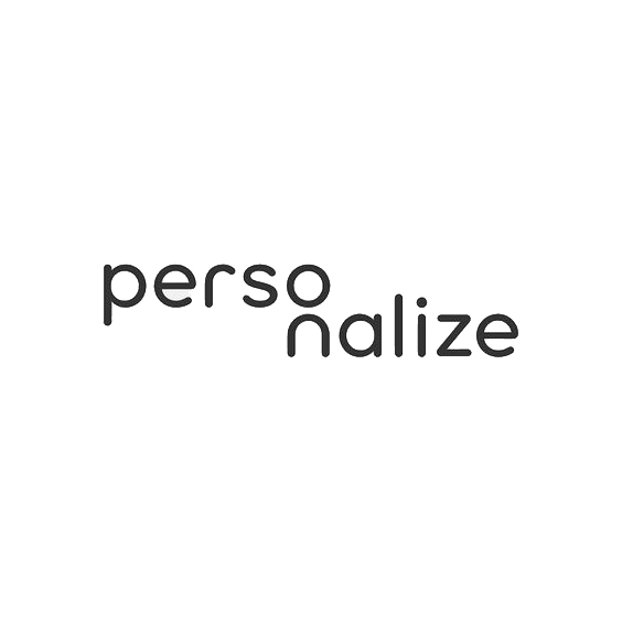
The 'personalize' logo stood out especially well to me because of the way the 'o' and 'n' had been positioned to create the image of the person. I decided that if I could achieve something similar with the name of my app in the logo I design, it would be very effective. Before I started sketching some ideas for logos, I wanted to have a look at some more logos. These weren't limited to university-style logos or hidden symbolism; they were just logos that I thought were effective.
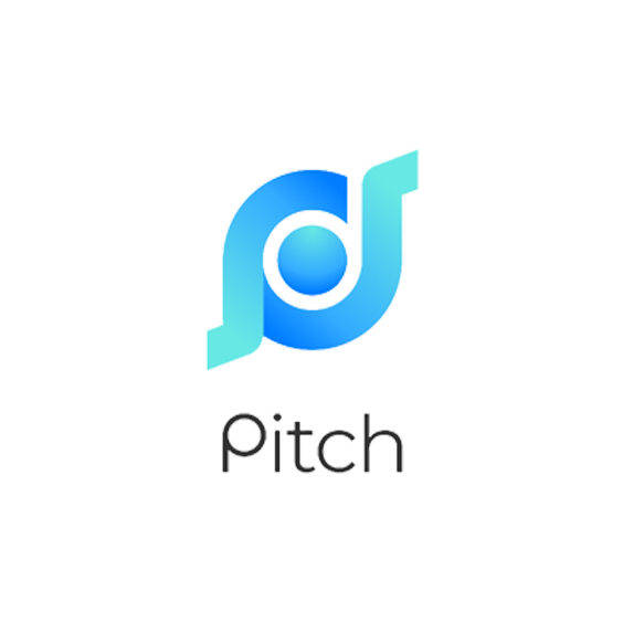
I found inspiration in these logos because of their interesting use of colour and the varying composition styles used. The 'pitch' logo utilises a colour gradient around a circular shape, which gives the impression of motion. This logo also makes use of Gestalt's figure-ground principle with the contrast created between the gradient's dark and light blue. Initially, I thought that the name of the company the logo was representing started with a 'd', as this is the first thing I saw when I found this logo. I thought this kind of hidden symbolism would be effective for use in my app's logo, as I knew the app would be named 'DegreePal'.
Colour Theory
After deciding that I was going to experiment with using gradients in my logo, colour theory research was essential. Figuring out which colours to use was also important for the app's UI design. As my app's aim is to ease stress and improve organisation, my chosen colours would have to portray this, for the logo and the app.Orange

Orange is associated with change and creativity. It can also be associated with health and vitality. Orange is also considered to be friendly and inviting. Because of these reasons, orange could be a suitable colour to use in my logo, as being friendly is part of the apps brand identity.
Green

Green can represent new beginnings and growth. As a mix of blue, which is known for being calming and yellow, known for happiness, its effect can be very therapeutic. Brighter greens are more energizing, whereas olive greens are representative of the natural world. Because of green's potential for being therapeutic, this looked like one of the colours I would end up choosing Green is also known for promoting stability, which is one of the things students said they required in my survey.
Blue

Blue is known to be a calming colour. It can also represent peace and spirituality. Blue is a colour which is heavily associated with sadness however, so I will have to experiment with the shades of this colour to ensure that the logo stays peaceful instead of sad. Bright blues can also be energizing and refreshing.
Animation Research
Click here to view my Behance moodboard containing a variation of animations.
Whilst researching animations to use for inspiration on the app's instructional video, I analysed some kinetic typography videos. The reason behind this was due to the nature of the video I needed to design, there would be a lot of narration, so kinetic typography seemed like an appropriate solution to highlight what the narrator was saying.
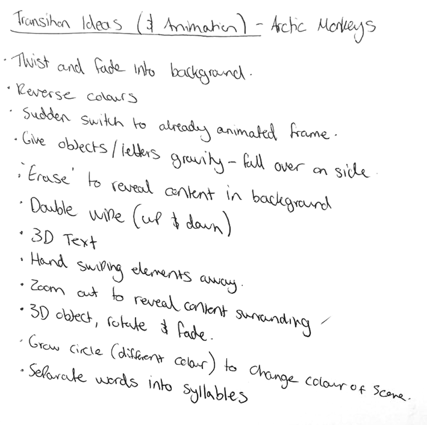
'Arctic Monkeys - Do I Wanna Know: Kinetic Typography Lyric Video'
Findings
Before working on this project, I had very minimal experience with kinetic typography animations. Prior to watching this video, I was struggling with coming up with ideas for ways to transition between animations and different scenes.
The way this video's motion designer transitioned between the song's lyrics inspired me greatly. Different zoom levels and camera angles in throughout the video to make it more engaging and create these transitions. Motion blur has also been added to various points where the tempo of the singer's words are espcially fast to make the animations appear smoother and less snappy. The designer also added a large amount of illustrations to visually represent what the singer was singing about in different areas. Another important and in my opinion, the most significant technique used in this animation is contrast. The designer has used contrast to instantly grab the watcher's attention and to maintain this attention the black to white ratio is flipped occasionally. These are all techniques which contributed to my final outcome.
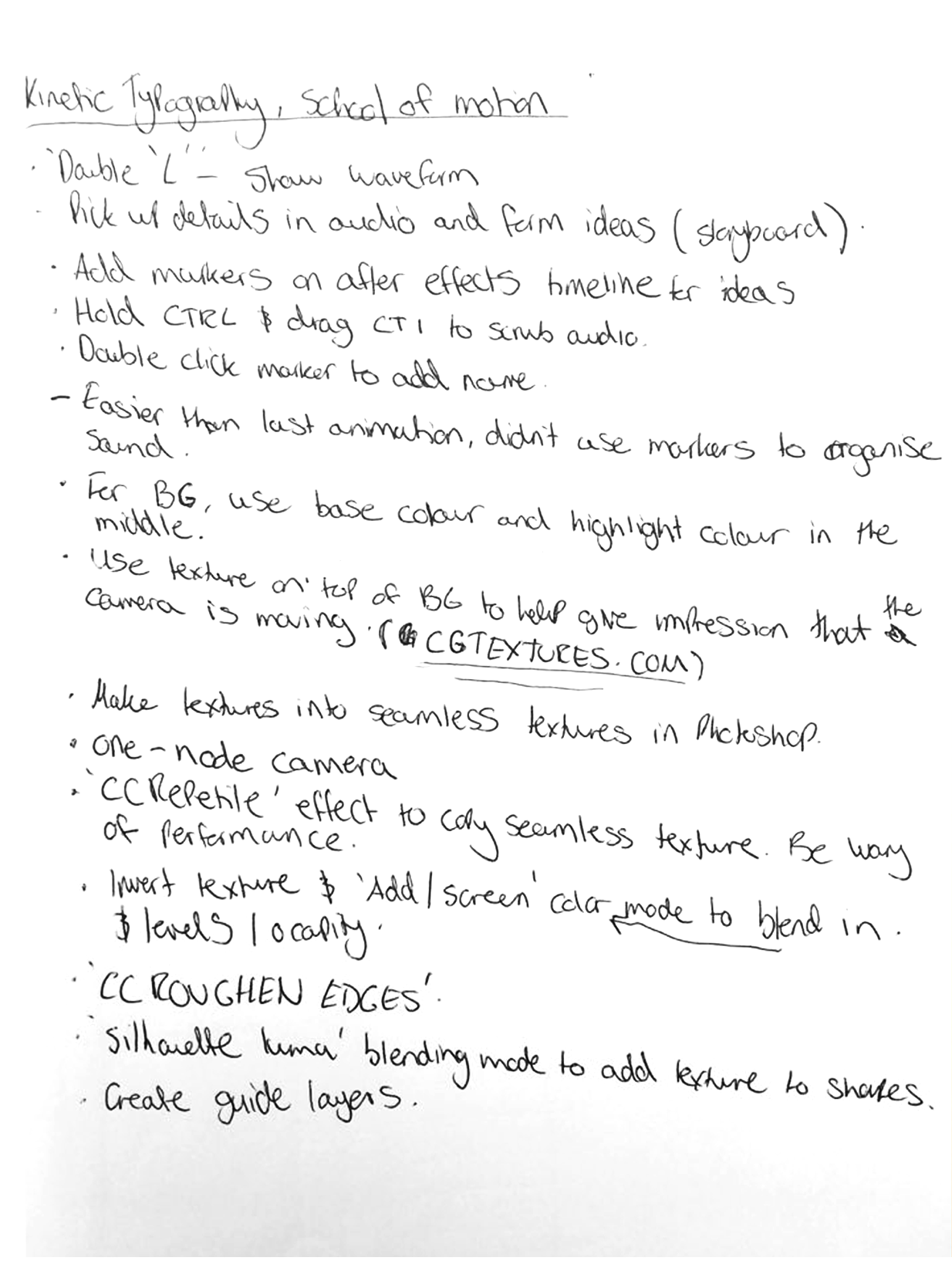
'Kinetic Typography in After Effects'
Findings
This video taught me step-by-step how to create kinetic typographic animations. I used this video to further solidify my After Effects knowledge and to learn new skills in kinetic typography. One thing that was particularly useful from this video was the information on using After Effects cameras to create complex motions in animations. Another positive that I gained from this course was an increase in my workflow. I found using After Effects a lot easier and smoother, making for a faster experience. This gave me confidence in my ability to complete this project, as there was a lot to do for this one.
Ideation
Once I was satisified with the amount of research I conducted, it was time to move onto the ideation stage. This was where I started to form some initial ideas about how this project's outcomes could turn out.
UI/UX
User Journey
I started off the app's UI/UX ideation by creating a user journey based on my research.
- Sign in using login details provided by a university admin.
- Student is then brought to dashboard, which displays the current week and all lectures/assignments due.
- From the dashboard, students are able to add items to their to-do list, as well as using the note transcribing feature to transform speech into text notes.
- Users can also navigate to the meditations screen, showing them a selection of five different meditations.
- Additionally, users are also able to access the chatting screen from the dashboard, where they are presented with a list of all their active chats. An option to start a new chat will be present at the top of this list.
- When the user has selected to start a new chat, they are presented with a list of different problems students face. The option to 'just chat' will also be available.
- Once a problem has been selected, the user is able to select to either chat anonymously or to display their name. After this, students will be paired with another student that has selected the same problem. Whilst DegreePal is searching for another student the user can minimise the app, as well as navigate to other screens within the app. DegreePal will notify the user when a chat has been found.
User Persona
Next, I wrote some user personas to help gain a clearer idea of who my target audience were. I used my survey results for this.
Tom Griffiths
- Age: 19
- Year of Study: 2
- About: Tom spends most of his time worrying about his grades at university. To attempt to reduce the levels of stress he experiences, he tries to manage his time using the calendar app on his phone, but he feels that this current way of managing his time could be improved with the addition of more reminders.
Sarah Thompson
- Age: 21
- Year of Study: 3
- About: Sarah is currently in her final year of university and is experiencing a lot of stress related to the workload of her course. Beceause of this, she also feels lonely. She currently doesn't use any apps to help reduce these problems, but believes mobile apps to be beneficial in helping manage stress. Sarah doesn't manage her time at university and feels that this could be improved with the addition of some sort of guidance.
UI Sketches
During the next stage, I used DegreePal's user journey and personas to form the first ideas about what DegreePal could like visually.
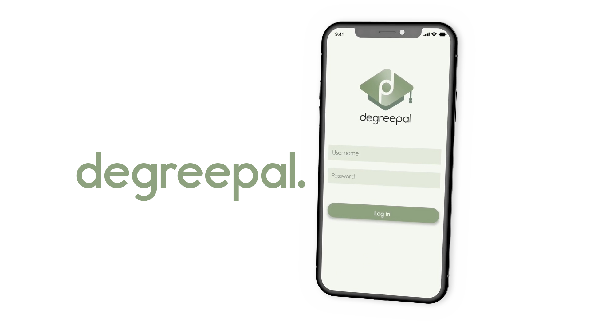
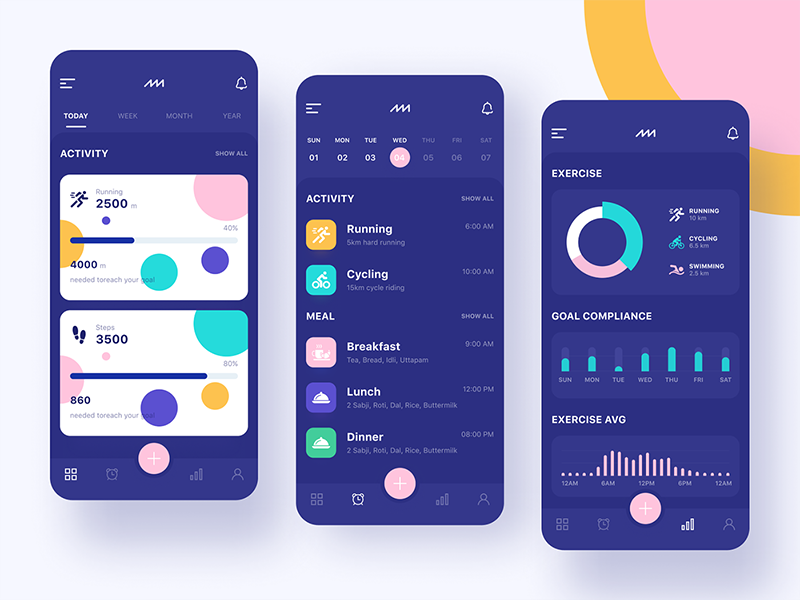
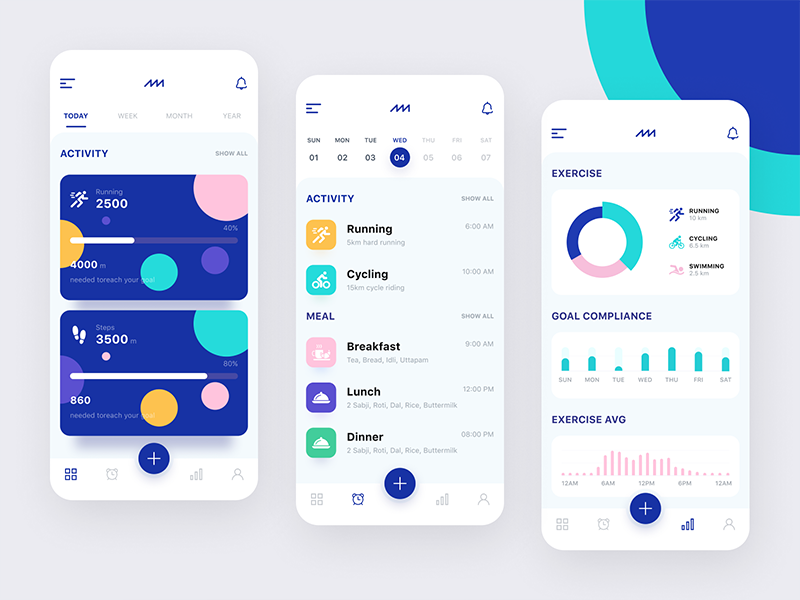
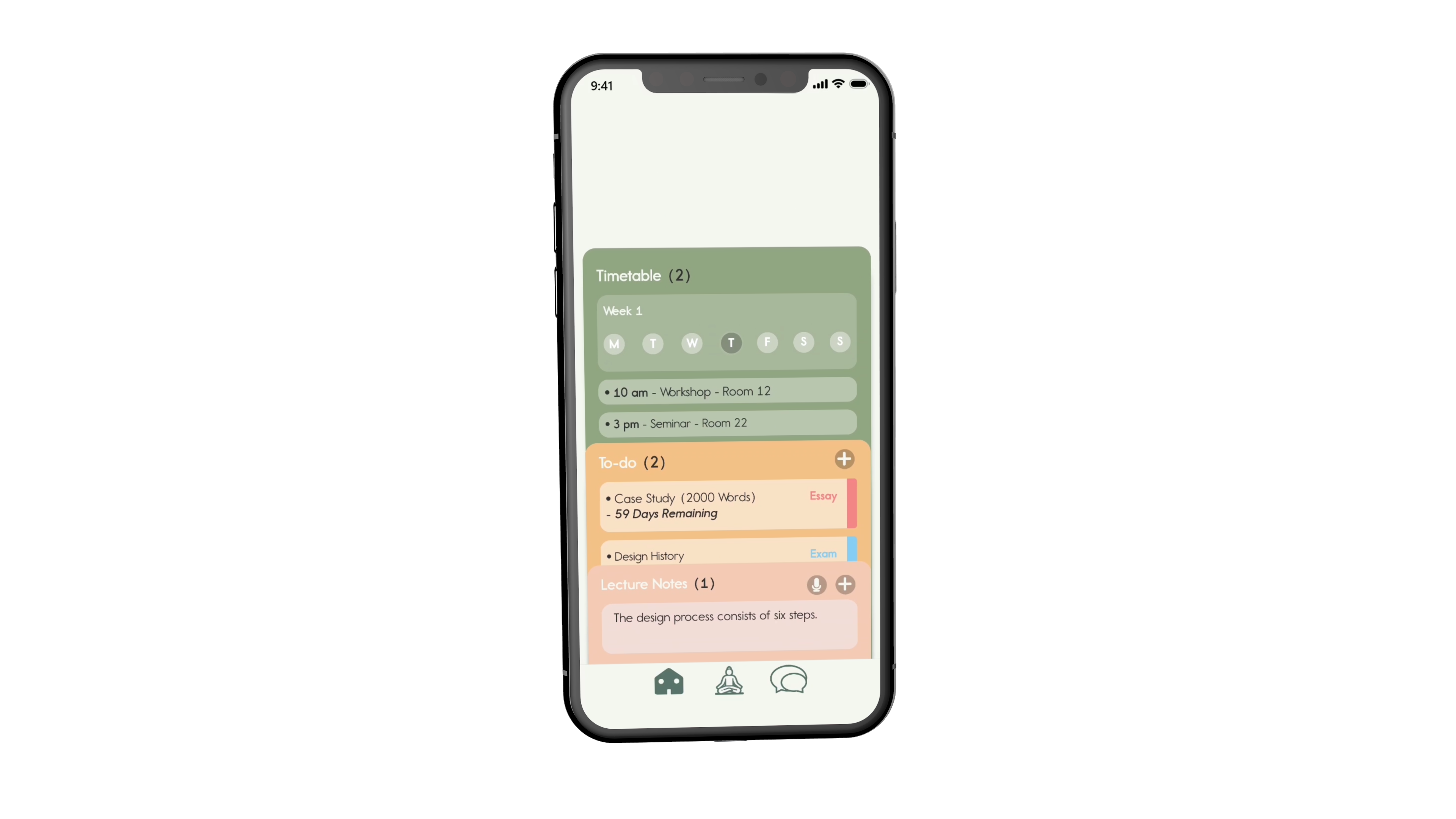
Login & Dashboard
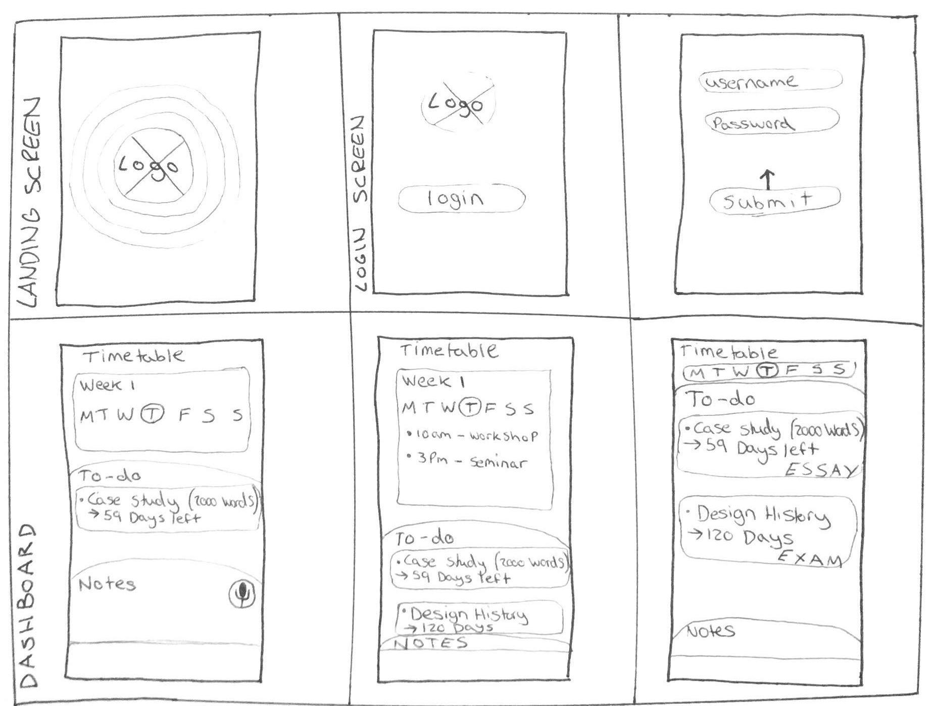
Within these sketches, I envisioned the app's login page and dashboard. I wanted the login screen to form a positive first impression for the user. I centered DegreePal's logo and then thought about using animations to move this logo upp, revealing the login fields and button. I wanted to create a modern and clean-looking aesthetic with this, based from my user surveys.
Using the 'App Light & Dark Version' from my research as inspiration, I pictured using rounded tabs in combinaiton with Gestalst's figure-ground principle to separate the dashboard into three segements that the user could change the height of with their finger. I wanted this to create an experience that the user could customise themselves, whilst not sacrificing efficiency.
Adding Entries
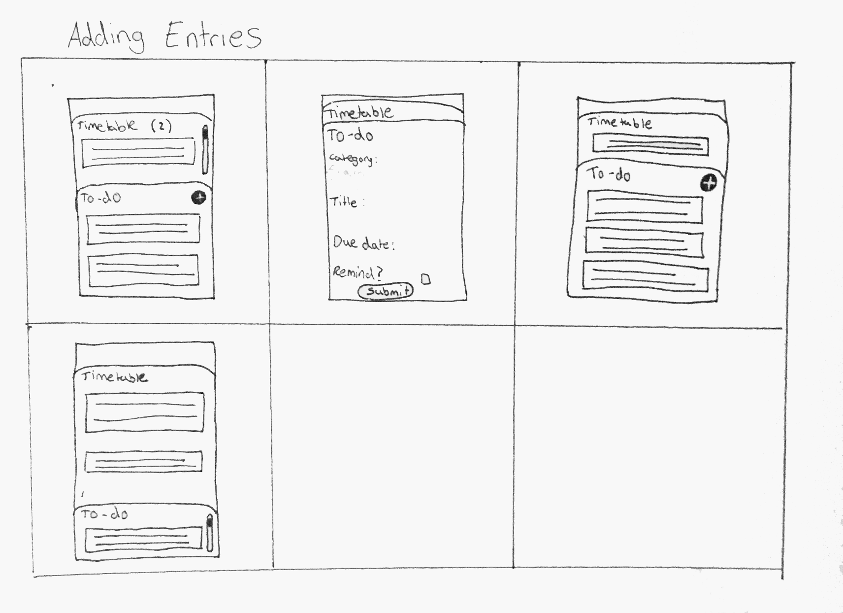
I wanted the user's experience of adding to-do entries to be quick and simple, as this was something the survey respondents mentioned in their answers. To do this, I imagined one of the tabs animating from top to bottom at the tap of a button, with a short form to fill in. With this form, users would be able to select a due date for the to-do item using an in-built calendar, along with choosing a colour to label it with for the home screen.
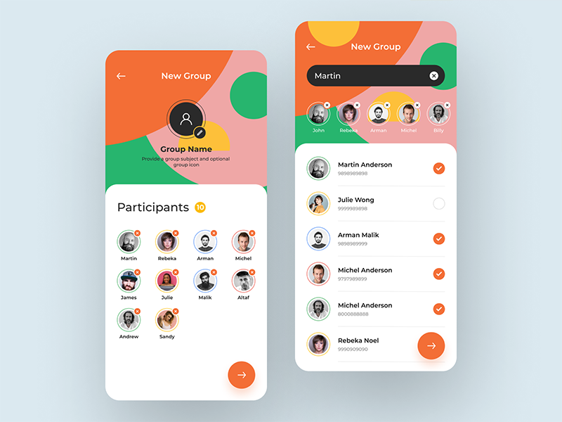
Select Problem
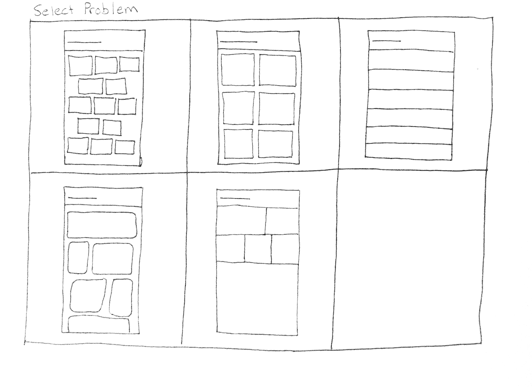
These sketches involve me devising a way to organise the buttons on the 'problem select' screen for the chatting feature. I had some trouble deciding which one to stick with. In the end, I chose to adopt the second box, as it was the most organised option due to its symmetry. Research I conducted during my second year of university uncovered that designs that are unsymmetrical could trigger someone subconsciously due to their unordered nature. Additionally, this would be a more consciously-recognised implication for someone with Obsessive Compulsive Disorder (OCD), for example.
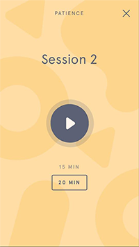
Meditations
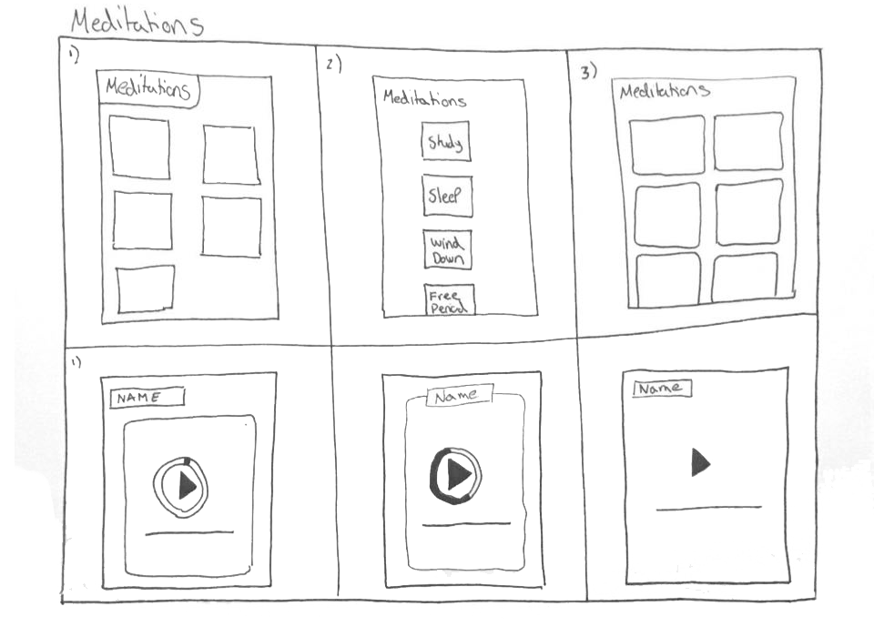
On this page, I was experimenting with how to portray the different meditation options. Because there are only five meditations included with the app, I chose to use the middle option, as this makes use of positive and negative space effectively. The user would be able to scroll through these options using their finger. I also investigated the different ways of designing an audio player. I chose to use a format similar to headspace's, utilising different colours and on-screen elements, such as rounded bounding boxes.
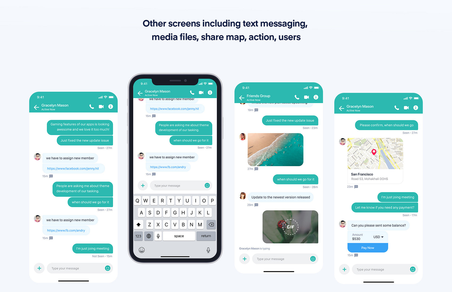
Chat
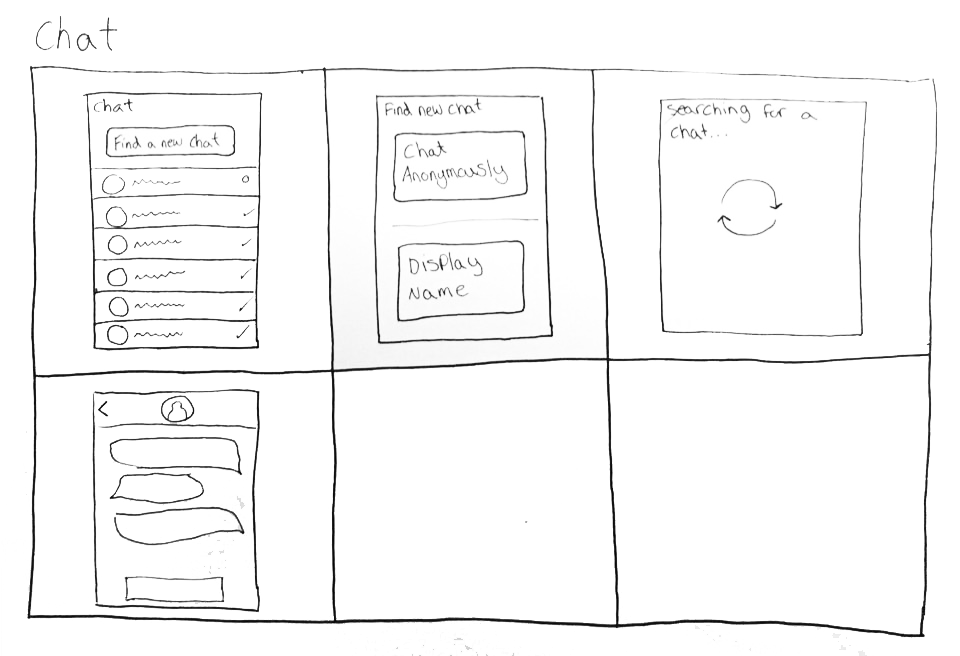
The design for the chat menu was quite similar to the chat menu of other apps, such as Facebook messenger. As discussed earlier, I found that this was a good thing, as the users would be familiar with this type of interface. For DegreePal's chat menu, I used Gestalt's 'focal point' principle, by making it more prominent than the other screen items, to draw the user's attention to it first and encourage them to use it. I would further make use of this principle during the development stage utilising a contrasting colour.
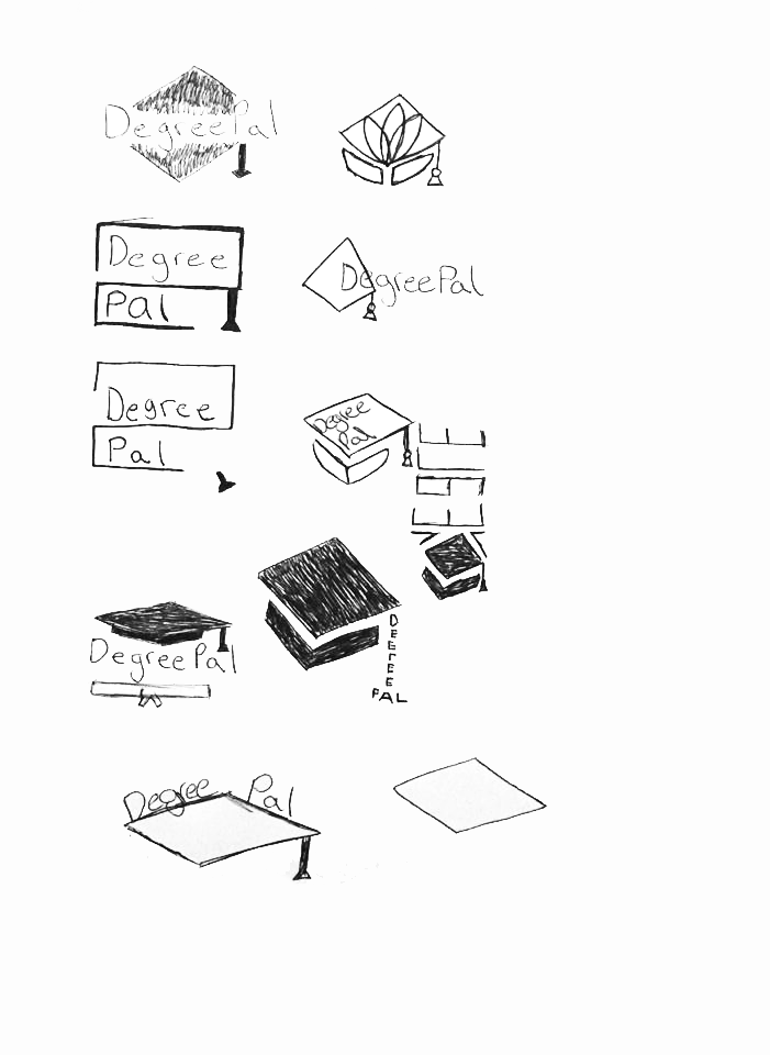
Logos
With an initial idea of what the app would contain and look like, I moved onto the logo design process.
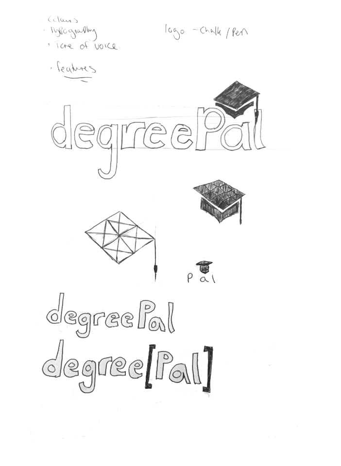
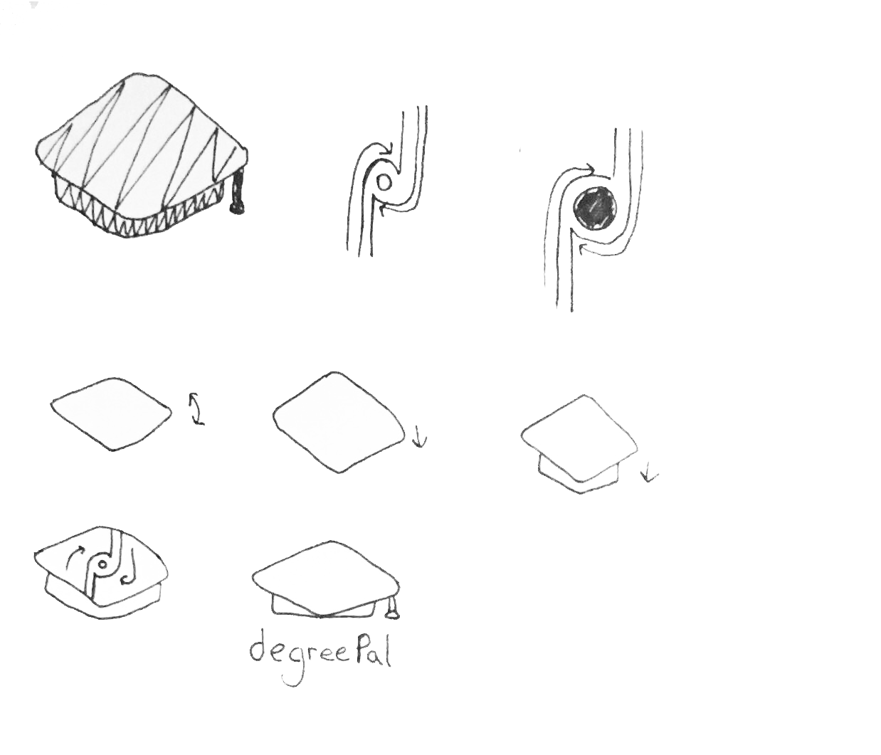
I used my research findings to create these sketches. As decided prior to this stage, I wanted to include the subject of university as the logo's main aesthetic. This was in an effort to attract the app's target audience, students. This univrsity-related item was a graduation cap. I wanted to do combine this aeshetic with a form of hidden symbolism as well, so I experimented with how I could do this.
Animation
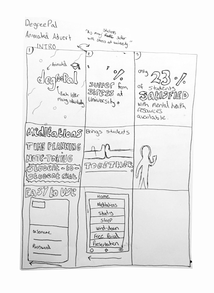
The animation ideation process involved creating storyboards for an animated advert. However with guidance from my lecturer and class mates, I believed an instructional video would be more appropriate, as it would allow me to demonstrate more of DegreePal's features. This storyboard was still helpful later on during the development stage, however.
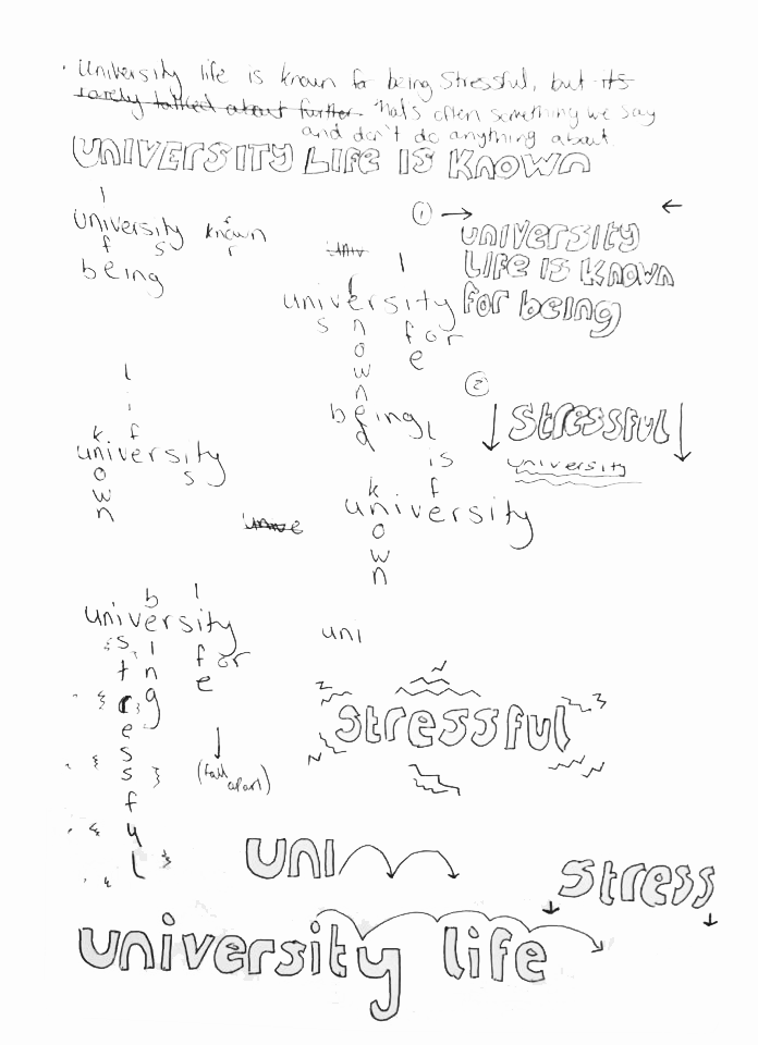
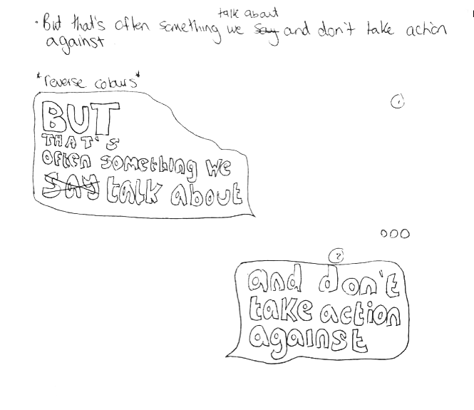
Within my sketches, I experimented with using kinetic typography to portray particular words and phrases. The Arctic Monkeys lyric video from my research greatly inspired some of the literal symbolism I brainstormed here.
Development
Logo
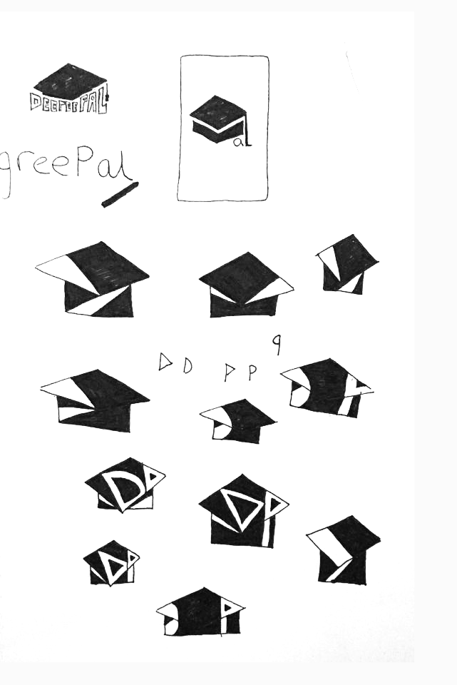
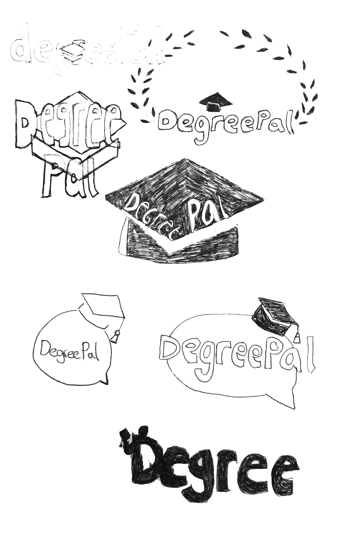
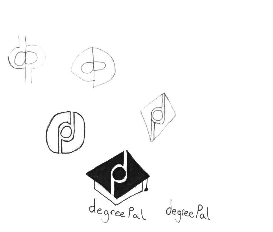
I started by using Adobe Illustrator to translate some of my sketches onto a digital format. This way of working also generated new ideas for logos.
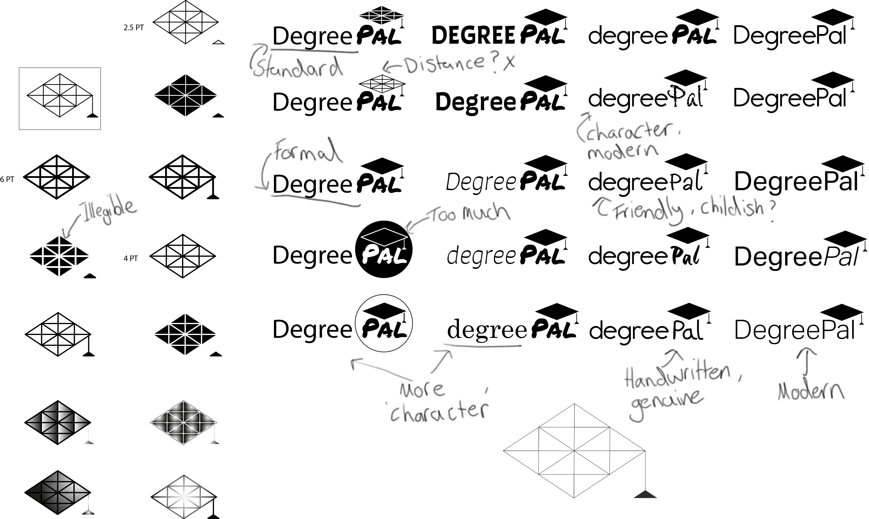
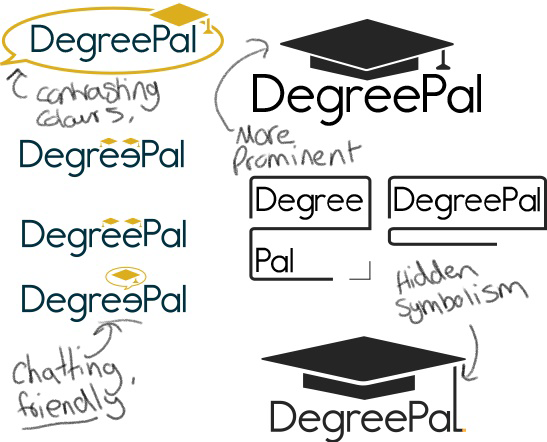
At first, I thought this was a suitable idea. However based on feedback gained from my peers on my course and my lecturer, who said that the logo needed a some more flamboyance, I started sketching some more ideas from my research.
With the sketches finished, I wanted to pay more attention to the typography used within the logo.
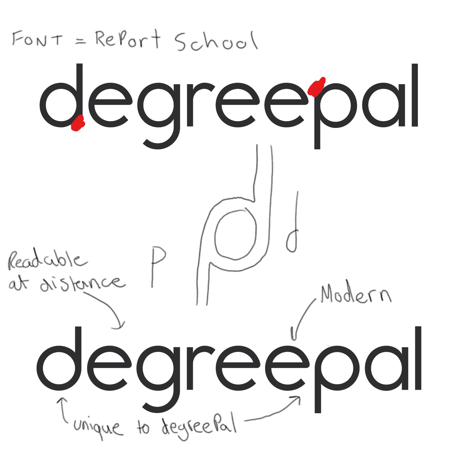
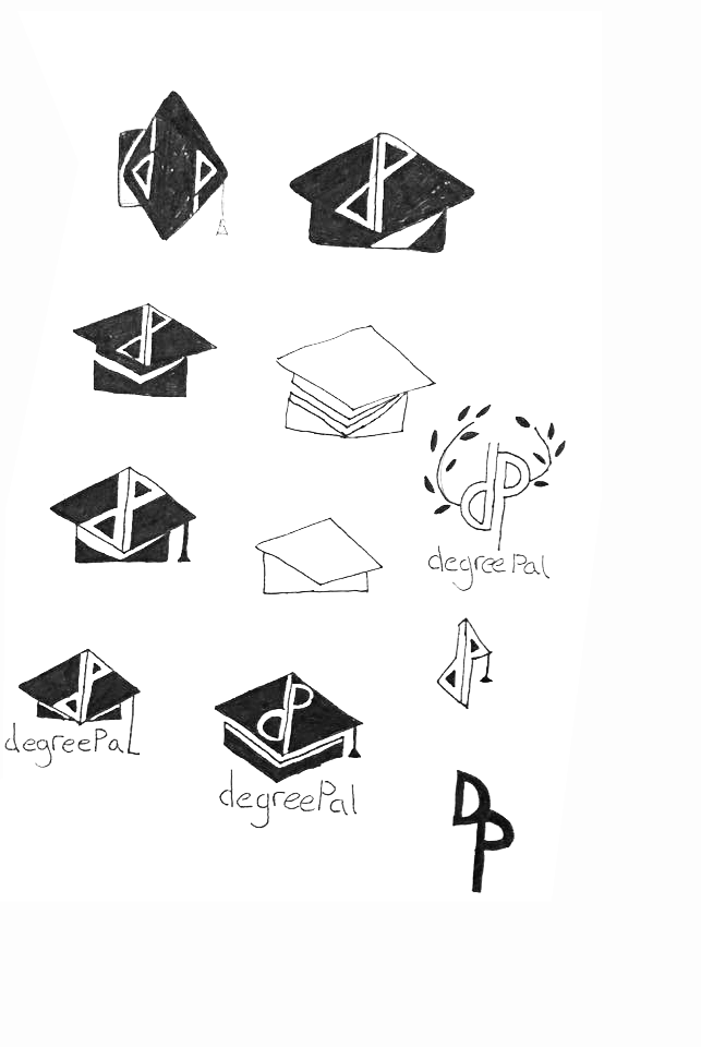
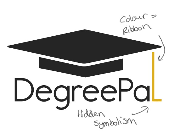
My sketches and research provided me with some inspiration for how to create hidden symbolism within my logo. I wanted this hidden symbolism to be highlighted through the logo's typography as well. I removed the serifs from the letters 'd' and 'p' so that they were representative of the symbolism I was aiming to use for the logo.
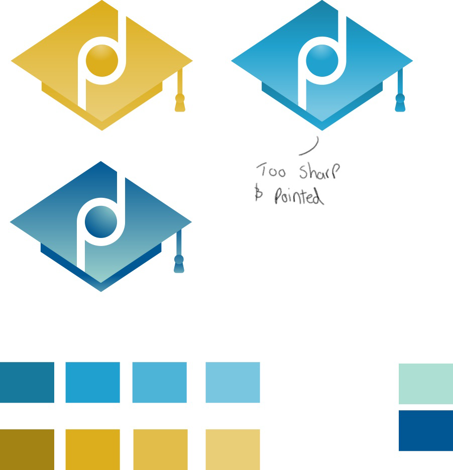
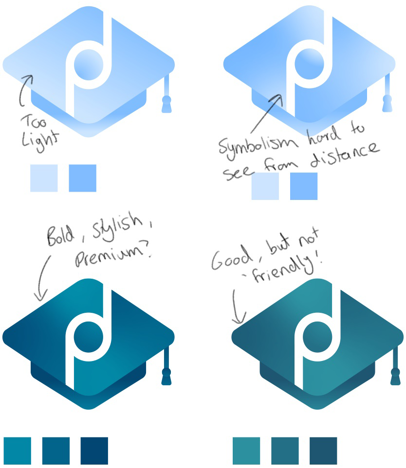
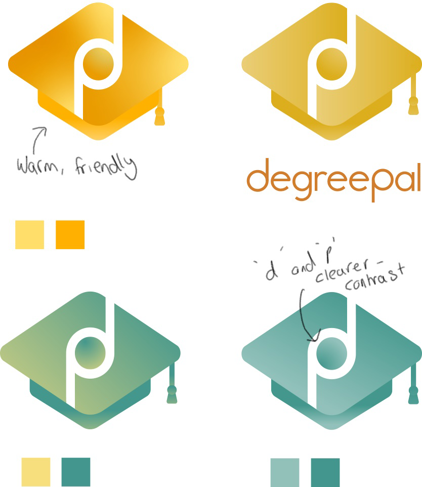
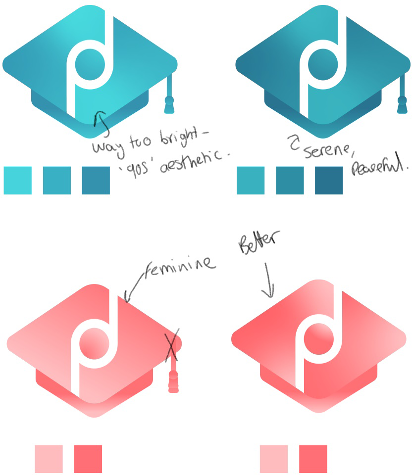
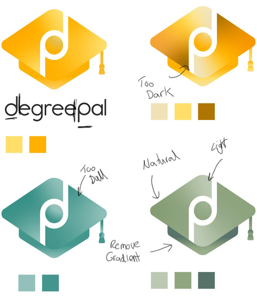
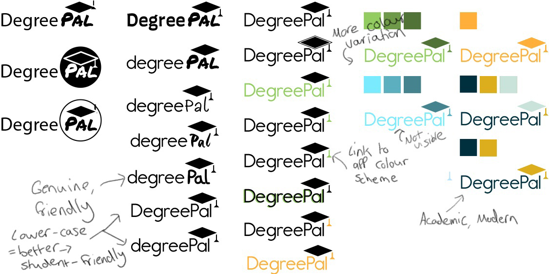
After testing out some sketches, I found I had created a design I was very pleased with. I had successfully incorporated hidden symbolism with the dual 'd' and 'p' as the central subject of the logo, along with the university graduation cap the most prominent subject. The logo also turned out very modern looking and I believed it would work extremely well as an app icon. Satisfied with the design, I used my colour theory research to experiment with which colours worked the best. A successful logo would portray a friendly, modern and approachable aesthetic, among the other desired brand messages. I initially thought using oranges and yellows would work the best, but it came across as too warm and exciting for an app about mental health and organisation. I tried using blues to create a peaceful aesthetic, but it ended up appearing too cold and dull- almost sad. Pink was the next thing I tried, but pink is a colour which is heavily used to portray femininity, which was a problem as my target audience was students of all genders. Green was the best colour, as it balanced the warmness of yellows/oranges with the peacefulness of blue. I believed the brighter greens to be too exciting and 'summery', so I darkened the colour. This resulted in a green that has natural and peaceful connotations, with an additional academic vibe.

Logo Prototyping
Once satisfied with the progress I made with the app's logo, I moved on to prototyping. I did this by creating mockups to see what the logo would look like in its desired environment. Whilst this was helpful, I wasn't able to get a full idea of the logo's aptness until the UI design was finished so I could pair the two together.

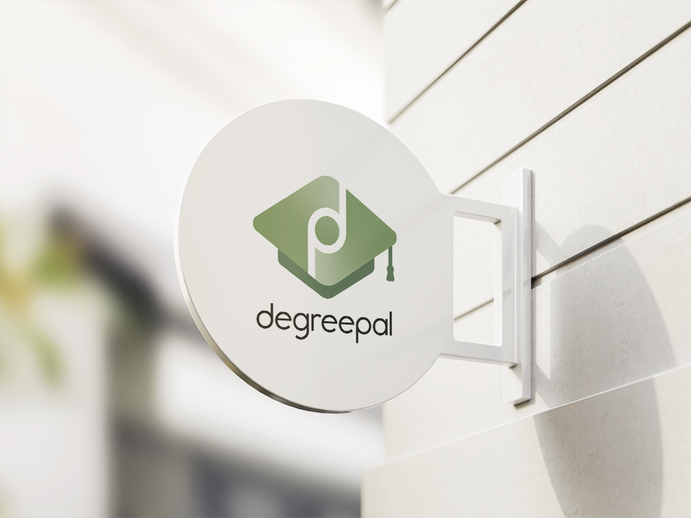
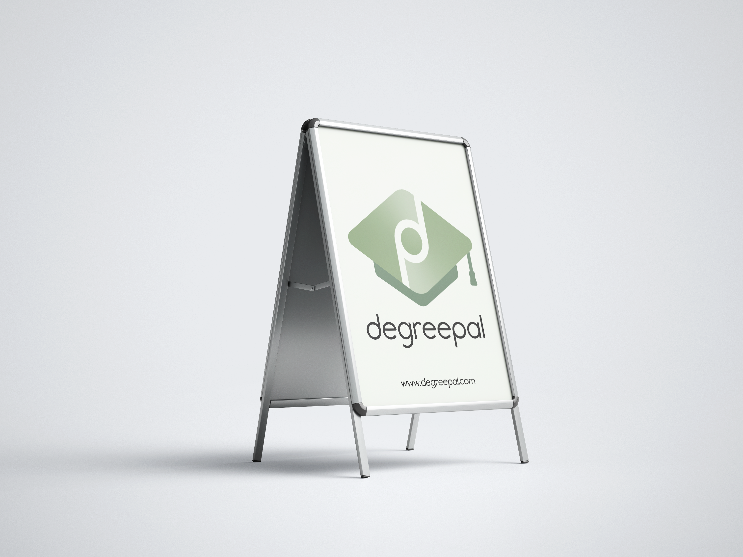
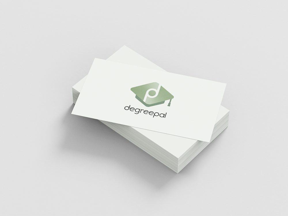
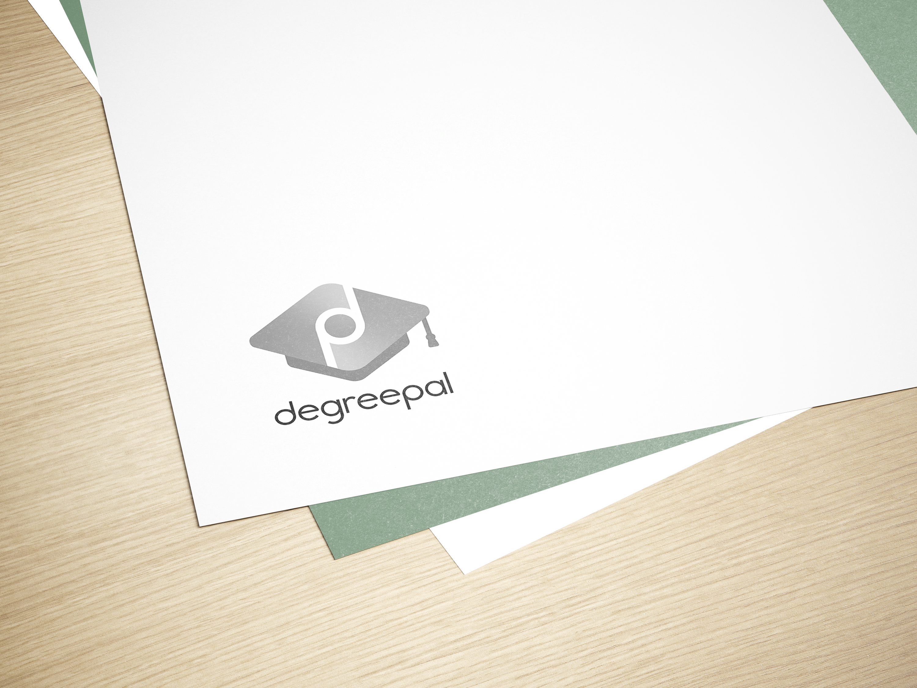
I am happy with how the logo turned out, as it is apparent that it's effective in a range of environments. The symbol and font are both noticeable at a distance and the contrast between the green and white attracts attention. It also works as a black and white format, so printing costs can be saved when preparing documents for print without sacrificing the quality or legibility of the logo.
UI/UX
Following the same process as during the logo development process, I used Adobe Illustrator and my UI sketches to create all the screens for the app.
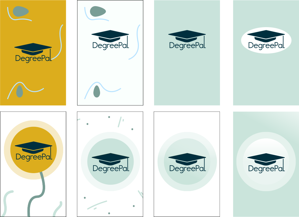
These are examples of landing screens I designed before I updated the logo. I wanted the UI design process with the landing screen so I could set the style for the remainder of the app. In these screen shots I was experimenting with the use of different colours and illustrations to appeal to my target audience.
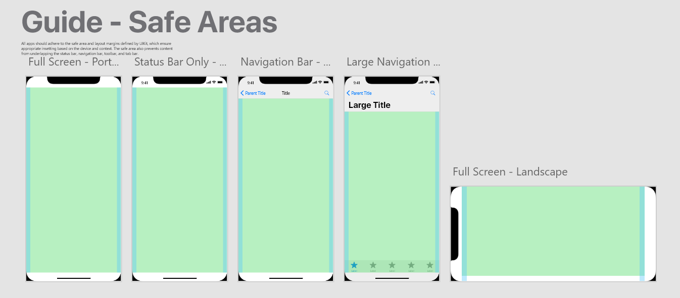
Next, I acquired Apple's iPhone X User guidelines. I chose to use the iPhone X as the model for my app design as it was currently the most up-to-date iPhone and I own an iPhone, so am familiar with its design principles. This Adobe XD document helped me check that my designs were contained within the screen's borders and that the header and footer elements were positioned correctly.
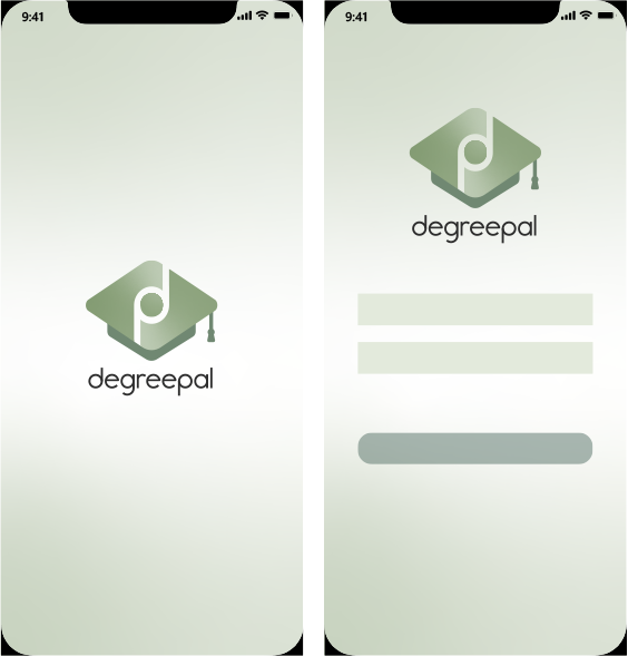
After finishing the logo, I updated the landing page designs. Here, I was experimenting with the use of gradients and a colour scheme to use for buttons and text fields. I used a contrasting blue-grey for the submit button to draw the user's attention to it.
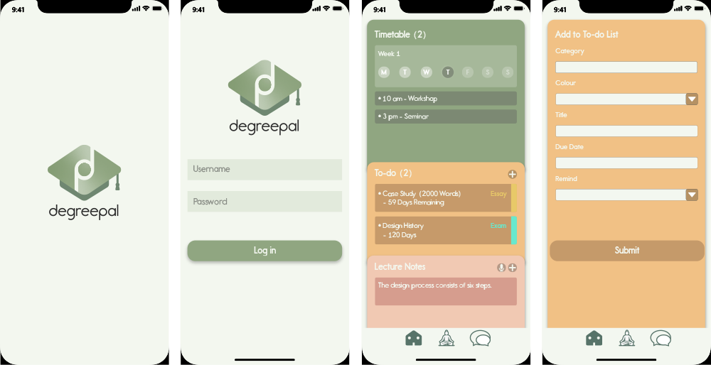
To better complement the logo, I changed the submit button to green. I also started designing the next screens using my sketches. Whilst choosing colours for the dashboard, I used three different colours that complemented each other well and promoted positive emotionss. These three colours had to be easily distinguished from each other, as they represented each of the movable tabs on the home screen. For the content on each tab, I used Gestalt's figure-ground principle in combination with the common region principle to group each entry together. I did this by using darker versions of each colour to create contrast and create a foreground and background. I also used a lighter pale green to create a background behind the group of tabs.
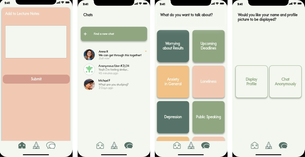
For the chat menu, I tried to keep the theme as much in-line with the dashboard's theme to ensure continuity of the user's experience. For important buttons, such as the 'Find a new chat' button, I used contrasting colours and scale to make the element stand out. For the chat subject selection screen, I also added drop shadows to give the buttons a 3D aesthetic, a form of skeuomorphism to tell the user subconsciously that these are buttons.
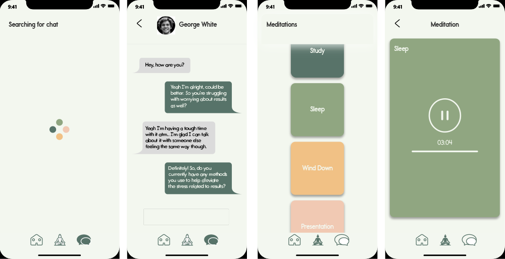
The last part of the initial illustrator app design process was creating the loading screen, the chat interface and the meditations section. For the loading screen, I utilised all of the main colours used within the app. This worked well because when confronted with this screen, the user would have already visited the dashboard and been introduced to these colours there. I wanted these colours to signify the 'organised' element of the app. I chose to adopt the traditional interface for the chatting screen, as there wasn't much room for differentiation here, as I wanted it to be familiar to users.
Once I was satisfied with the app's visuals, I presented them to my house mates (students). They said that the app looked clearly structured and like an app that they wanted to use. I also presented these designs to my university lecturer who complemented them, but reminded me of the importance of making sure all screen objects are aligned correctly. I adjusted certain areas of the design, such as on either side of the movable tabs, and then proceeded to the next stage.
Outcome
Whilst prototyping the app design, I came across some elements of the design that I needed to improve and some things I needed to add.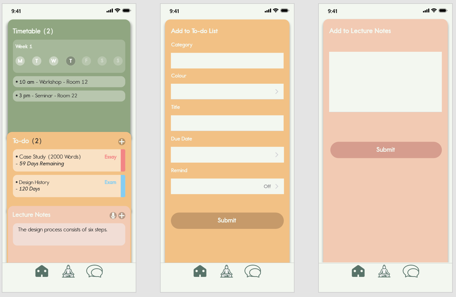
To make the text on the dashboard more legible, I changed the colours of the bounding boxes from darker to lighter ones. I also changed the font colour from white to black. This created a higher level of contrast, making the text easier to read. This also made the interface in general look a lot lighter and friendlier. For the 'Add to To-do List' screen, I swapped the text fields and arrows I designed myself for the text fields from Apple's UI kit. I did this because the Apple text fields look a lot cleaner and iPhone users would be more familiar with these types of fields and their function.
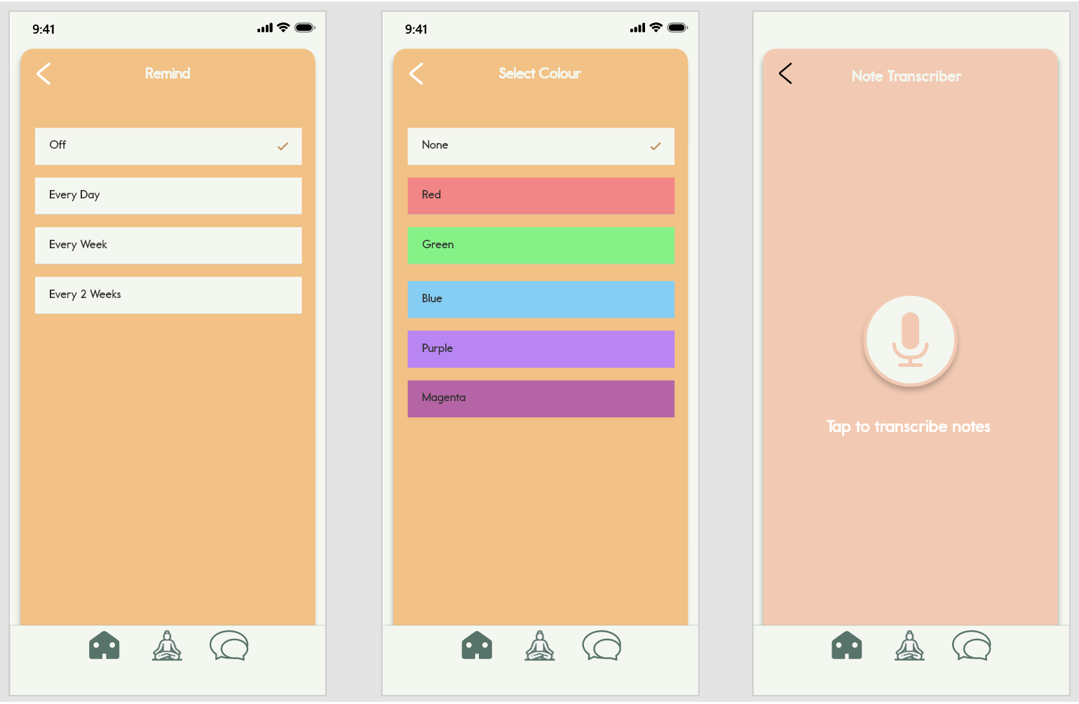
I also added the 'Select Colour' menu, once happy with the 'Add to To-do' list's overhaul. To ensure that the colours on this menu didn't clash with the app's colour scheme, I used versions of the colours that were almost pastel-like in appearance. This resulted in a menu which complemented the res tof the app. This was also important because these colours would also be displayed on the dashboard when selected to be a colour label for a task. Additionally, I added the Note Transcriber's interface. To ensure continuity, I designed this to be similar to the Meditation player. For extra guidance for the user, I added text below the record icon to explain how the transcriber works.
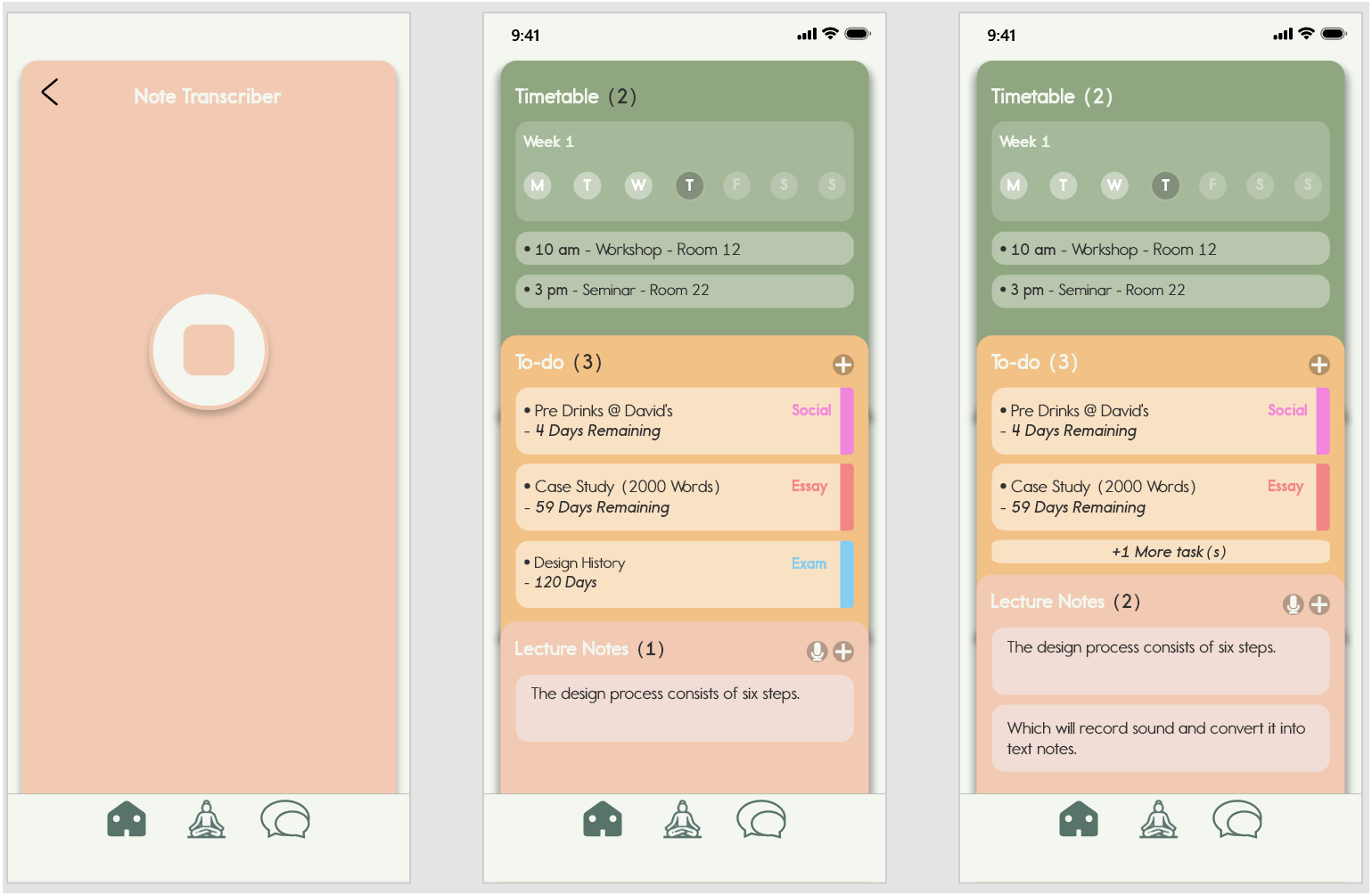
In these screenshots, I was demonstrating how the UI adapts when entres are added to the dashboard. When entries are truncated, the boxes will shrink and the text will be replaced with '+1 More task(s).' This ensures that no information is hidden from their awareness and that their university life is as organised as possible.
UI Prototyping
This stage involved importing my Illustrator screens into Adobe XD as SVG files. I did this because some elements were not scaling properly as I was integrating the designs between the two programs. Once all of the screens were imported into XD, I imported this XD file into a program called Protopie.
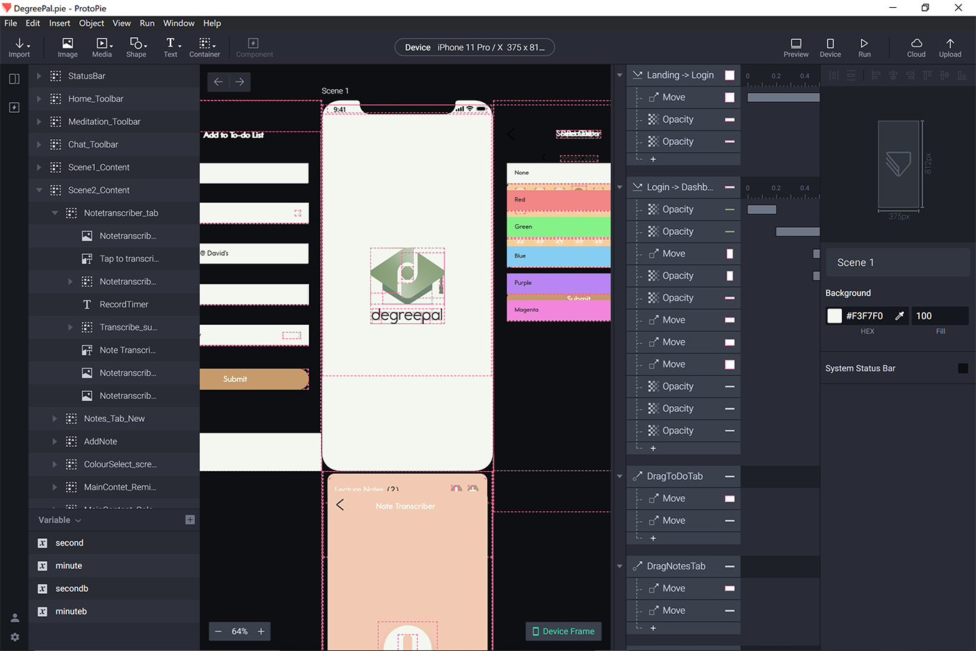
Protopie provided me with the ability to bring the app designs to life by adding animations and creating transitions from screen to screen. This was a lengthy process, as this involved creating interactions for most of the app's buttons. Despite this, Protopie was a very useful tool, as it provided for a much larger degree of prototyping than Adobe XD.
Working Prototype
Click here to try out the working prototype.
Instructional Video
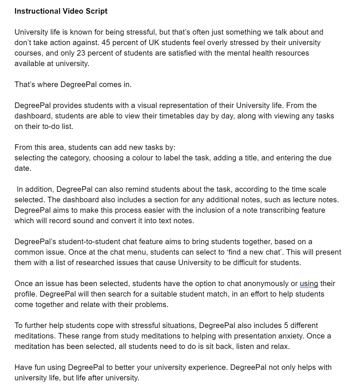
With the prototype of the app finished, I started work on DegreePal's instructional video. I started this by writing a script explaining the current problems students face at universities and the ways DegreePal addresses them.
Next, I recorded my girlfriend reading through this script. I wanted a to use a female voice for this because I believed it to be easier to understand and friendly, which is important when creating instructional videos. These two factors would also complement the app's desired brand image. Additionally, my girlfriend had also recently graduated from university, so she more or less fit the app's target audience. With the audio recorded in separate takes for each paragraph, I needed to piece it all together.
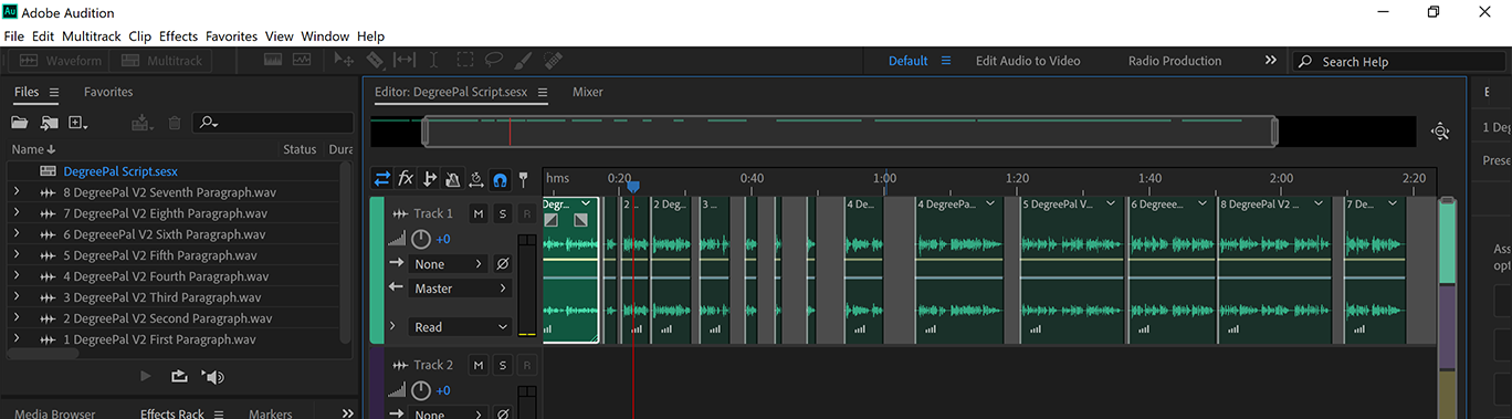
I used Adobe Audition to join all of the best takes together. In areas where the narrator was speaking too fast, I created gaps in the audio track.
Using the Protopie app on my phone and a mobile screen recorder, I recorded myself browsing through the app making certain actions, according to what was being discussed in the audio track. With the instructional's main content completed, I moved onto the next stage, which was creating an animation for the video's introduction.
To create this, I used my sketches on kinetic typography to create text animations to accompany the narrator audio. I used Adobe After Effects for this. I also used what I had learned from the Arctic monkeys video and the After Effects tutorial to create dynamic movements between the different words and phrases.
I also used a free iPhone X 3D render I found online to prototype the app within the instructional video. I was pleased with how this turned out, as it created a modern aesthetic for the video, which was one of my goals. Once this part was completed, all that was left to do was combine it with the rest of the clips. I did this using Adobe Premiere Pro.
Outcome
Please find below the final DegreePal instructional video!
Conclusion
This project has greatly improved my design skills in a multitude of areas. Before taking on this project, I knew it was going to be a lot of work and it has taken up a lot of my time. However, I'm very happy with this project's outcome. I believe DegreePal looks very professional and I have received a lot of very positive feedback on it on social media. This project has further shaped my idea of what type of job role I would like to work in starting my career as a designer, as I have greatly enjoyed the UI/UX, branding and motion graphics work conducted during this project. This has led me to believe that joining a design agency and freelancing would both be viable options.
Brand Guidelines
Click here to view the DegreePal brand guidelines.
Self Assessment Form
Click here to access my self assesment form.
NLT 2 Form
Click here to access my updated NLT2 form.
References
- Collier, S. (/2019) Nearly Half of Students are Stressed at UK Universities. Topuniversities.Com. Available at: https://www.topuniversities.com/student-info/university-news/nearly-half-students-are-stressed-uk-universities%0A