iHASCO - Summer Work Placement
Click here to download my updated NLT1 form. (See Reflective Process Report for proof of placement.)
Click here to download my self assessment form.
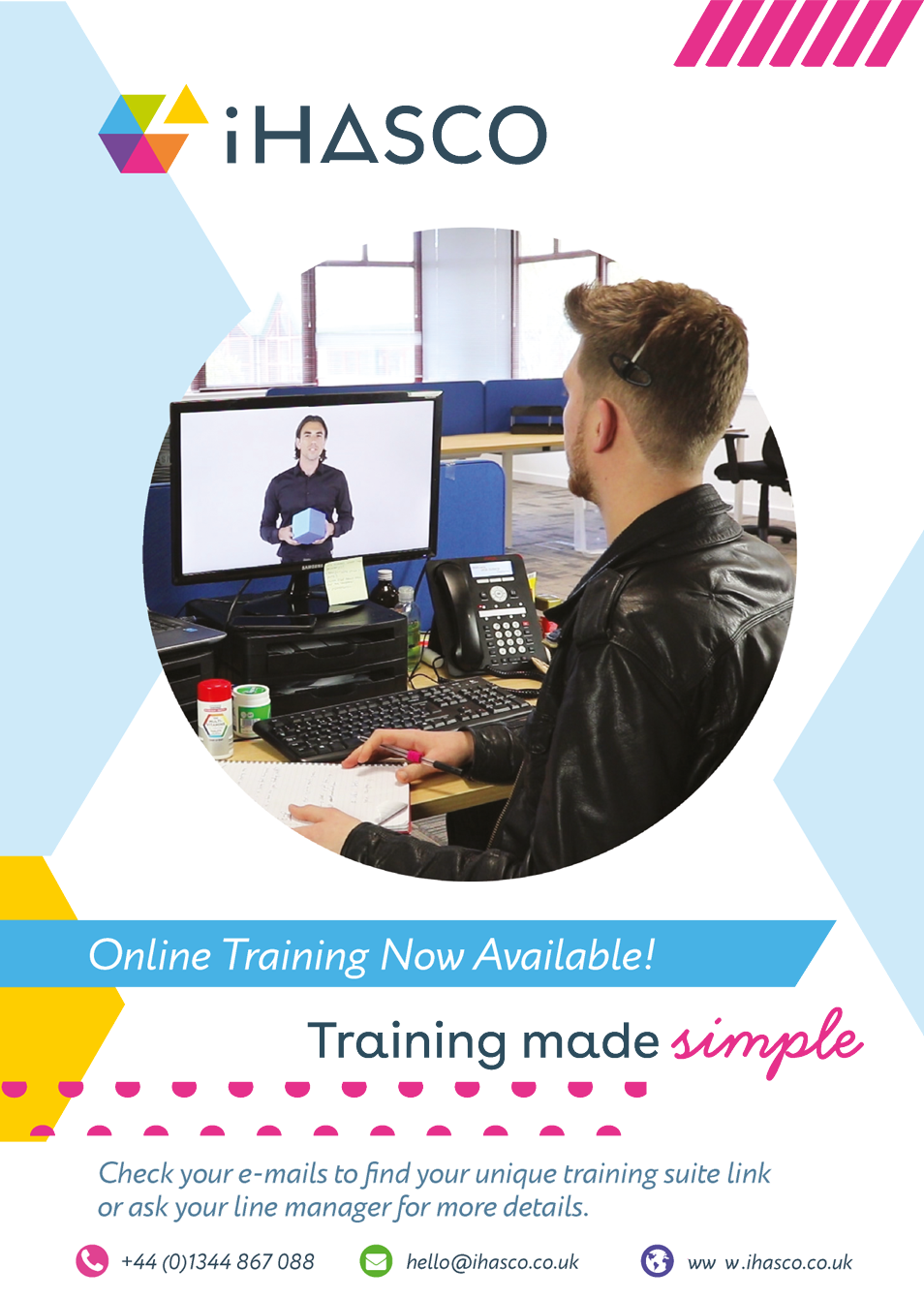
During the summer of 2019, I had the pleasure of securing a work placement at iHASCO, a company that develops and markets branded eLearning courses to other companies and institutions. Whilst at iHASCO, I had the opportunity to work with their in-house design team. This allowed me to gain a lot of insight into how designers work together in an office environment. I also picked up a lot of new skills in many different pieces of software; many of which I had rarely used before. Have a look below to see what I got up to!
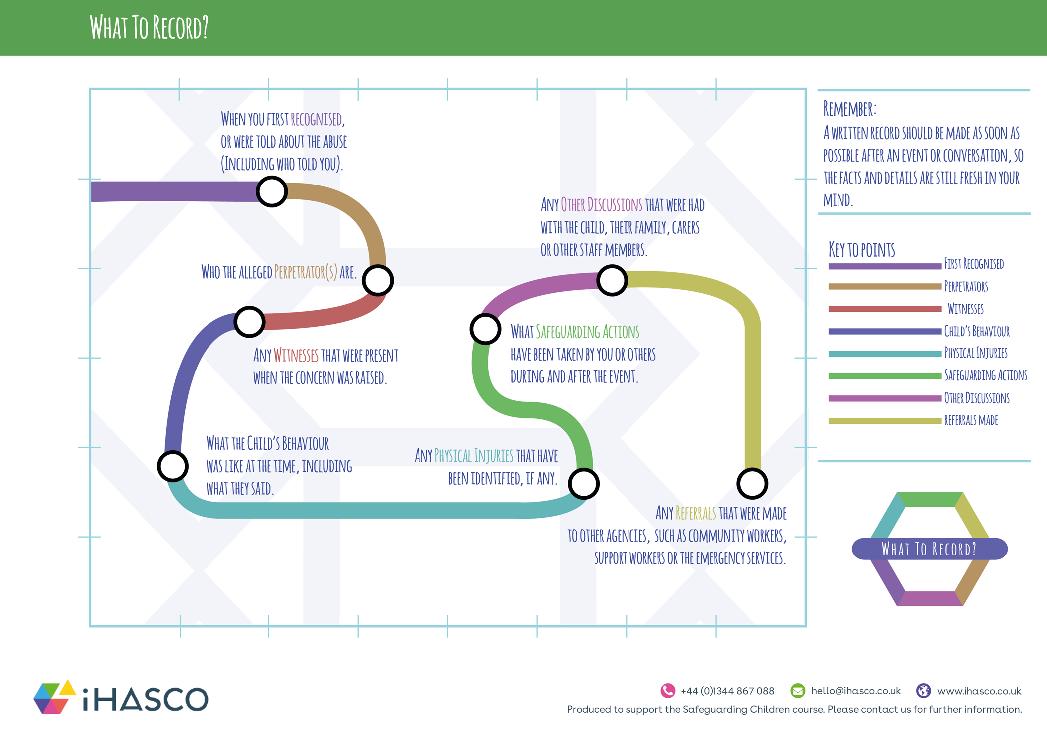
What to Record - Motion Graphics & 3D Modelling
The main project I worked on during my time at iHASCO consisted of designing and completing a section for one of their upcoming courses, Safeguarding Children. To start this, I was provided with a video clip of one of their narrators reading the content for the section, along with the transcript.

Within this part of the course, the narrator is reading from a long list of things to do when recording a Safeguarding incident. One of the main aims for this section was to represent this list in an engaging, appropriate and visually appealing way. To devise a solution to this, I started writing down some ideas.

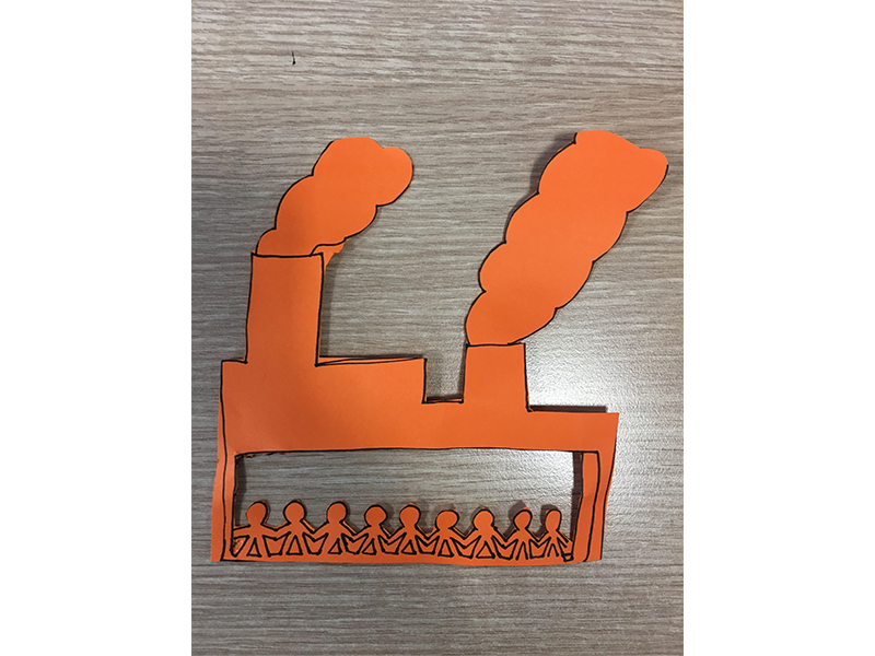
Due to the fact that Matt, lead designer on this project, was using a Train to represent some of the information in one of the earlier slides, I decided the best possible way to represent each point on the list would be to incorporate a 'Train Stations' scene. This would ensure continuity from the previous slides and would be an engaging way to represent the information. Within this Train Stations sequence, there would be a train visiting each point on the map, represented by a coloured station. I would use 3D modelling software, Maxon Cinema4D, to create these train stations and a combination of Adobe Illustrator/After Effects to produce the animated map within the 3D animation.
Research
The main form of research I conducted for this project was in the form of Visual References. As I already had a firm idea of what I wanted to do for this project, I didn't need any further inspiration on how I would animate it. However, I did complete a LinkedIn Learning course covering the basics of Cinema4D before I was given this brief. Before moving on to create this animation, I used visual references to assist me with the design of some of these assets.
One of the biggest influences for the design of this project was the London Underground Tube Map.
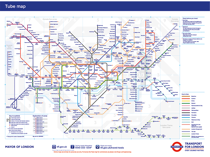
Inspired by the design of this map, I used its clear structure and its utilisation of colour co-ordination to create a simplified version of the map, designed for the purpose of the iHASCO course. I also used the colours used in iHASCO's logo, to keep it relevant to the company's brand. I chose to use this map as inspiration to portray the information within the list as clearly as possible.

I planned to animate the map I designed, using the tube map as a reference, to create paths between each station and display a representational graphic alongisde them, once the train had reached them. I did this by using After Effects's trim paths tool, alongside the pen tool.
After showing the animated map to the iHASCO designers, they suggested that I added other animated elements which would appear when the train reaches each station. This was great advice and the addition of symbols which represented the station the train was currently at made the animation a lot more engaging. They also suggested that I added a key to the map, to make it look more like the London Underground Tube map. I was initially going to add this, but was worried it would distract from the information being spoken about. The other designers said this would be fine and I agreed with them once I added it in.
To add the animated map to the Cinema4D scene I had created with the train stations in it, I used Adobe Media Encoder to render the animation as a PNG Sequence. This separated each frame and saved them together in a folder as PNG files. Then, I set the first PNG frame as the texture for the object I wanted the map to be displayed on. After this, it was just a case of using syncing up the frames with the audio track, using a copy of the audio in Cinema4D which I removed when it was all synced up. The Cinema4D scene was imported into After Effects, with the master audio track being used there.
3D Modelling
3D Modelling was something I was completely new to. Apart from having completed the LinkedIn learning course, I was new to it. Within this project's final outcome, I designed a train station model which would act as the location for all of the scenes.
To create the illusion that the train was actually moving between different stations, I changed the colour of the roof of each station to the colour represented on the map, as well as the 'name' of the station above the map. The camera would zoom into the station, the train would move to a different point on the map and the camera would zoom back out again, showing the different coloured roof and station name above the map. To prevent this from getting repetitive and perhaps boring, I added different props to some stations, such as a crutch at the 'Physical Injuries' station and a police car I modelled at the 'Referrals' station.
Here's the final product!
Child Trafficking and Modern Slavery - Motion Graphics
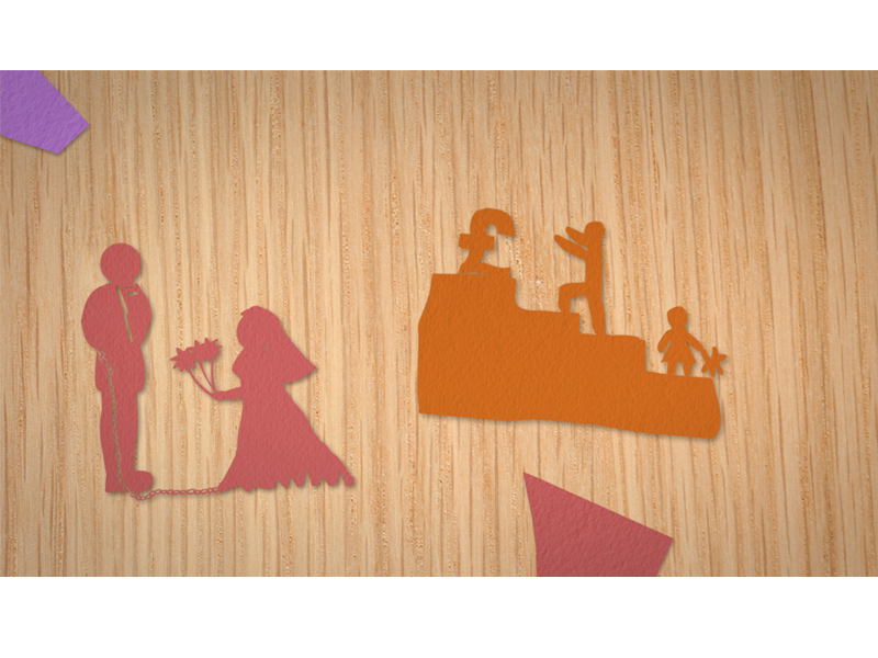
Another task I was provided with was the creation of a section of another upcoming course; Modern Slavery. To start with, Matt provided me with an idea of what he wanted this section to contain. Within this section, the narrator is reading through a list of the reasons why children are trafficked.
To visualise the items in this list appropriately within my animation, Matt asked that I made symbols of each list item in the style of paper cut outs. To do this, I drew each symbol onto card and photographed each one.
After this, I imported the images into Adobe Illustrator, where I used the pen tool to 'cut out' each shape from the background. I did this fairly roughly so that they would retain their 'hand-cut' aesthetic. After importing the shapes to After Effects, I used the track matte feature to overlay a paper texture onto each shape, along with changing the hue/saturation of each one to adjust the colours.
To make the scene look as if it was taking place in a 'child-like' environment, I used a high-res image of some wood grain to make the background appear like a table. Additionally, I created random cut outs to add scrap pieces of card to the table, along with items such as pencils and scissors. Finally, I added shadows to all of the items on the table to add to the realism.
To animate the scene, I created a new composition within After Effects and placed the table top composition within it. Because the table top composition was a lot larger than the screen resolution, I was able to change the table top's position and scale values to make it look like the viewpoint was moving. I timed these movements with the narrator's voice and was resulted with the final product.
Feelings & Concerns - Motion Graphics
I was also tasked with creating an additonal slide for the Safeguarding Children course. This one was detailing what to do if a carer had any additional Feelings and Concerns about a Safeguarding incident.
In the same fashion as previous projects, I was given a transcript to animate. After completing the previous projects, I was more familiar with the use of After Effects, which is why I was confident in my ability to fulfill this task. To start, I drew up some sketches for how I would do this.
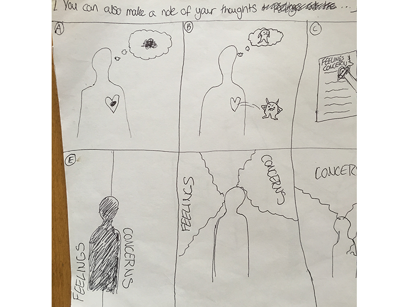

After creating only a a few sketches for this animation, I had a good idea of what I would create for this section, so I got started with it. I really enjoyed making this animation, as it really challenged me and I'm happy with the outcome.
Have a look!
Branding Design
As well as animation, I was also tasked with creating branded material for the Marketing Department, as well as additional course material in the form of PDF posters. Whilst designing these posters, I had to adhere to iHASCO's branding guidelines.
Research
You can find all of my visual research for the posters I designed for iHASCO on my Pinterest board.
These posters inspired me greatly and I used them for visual reference whilst designing iHASCO's branded material. The way the first 'layers' poster uses colour and the 'multiply' blending mode inspired me to incorporate this into a design utilising iHASCO's brand colours, for example. The 'Superhero' poster maintains it's visual appeal, despite the fact that it is very text heavy. This was something I tried to use within the last poster displayed below. Finally, all of the posters I used as visual references utilised white (or light!) space to create balance between colours. This was one of the most important techiniques I have picked up and added to my brand design skills.
Branding Material