3D Agency - Brand and Web Design
The Brief
We started the design process of this project by both drawing up some logo ideas. We planned to then choose a logo that would suit the company's desired identity of professionality and premium service.
We also drew up some web designs for me to use when I moved on to design the website prototype using Adobe XD, whilst Kemma designed the Brand Guidelines using Adobe InDesign.
We started off by researching some other similar logos for inspiration. We thought these logos matched 3D Agency's desired company aesthetic of professionality and exclusivity well.
Please find below the details of our design process.
Logo Research
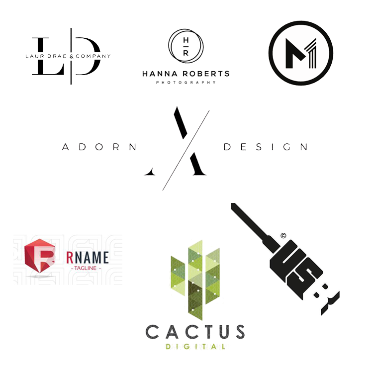
The first step of my design process involved using Pinterest to find the above logos and use them as inspiration. The client specified that 3D Agency is a company that offers high end services and its target audience is other businesses. With this in mind, I decided that 3D Agency’s branding should pertain to a premium, exclusive aesthetic. The logos above demonstrate this type of style very well. I particularly like the ‘Cactus Digital’ logo and the way the designer has used a composition of isometric shapes to create a larger Cactus shape. I experiment with this style of design later on in the design process.
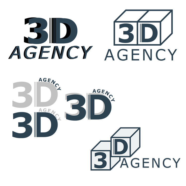
Below are examples of some of the logos I designed, based from the research I conducted.
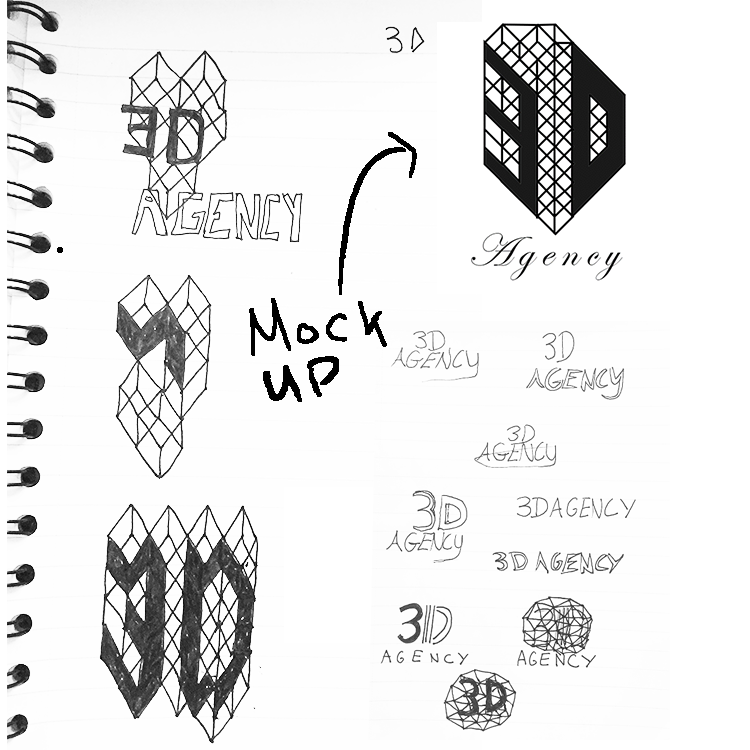
Initially, I really liked how the isometric style complemented the name and type of company 3D Agency are. I thought it complemented both the 'digital' and '3D' elements of the company perfectly. However, I couldn't quite create the desired outcome in the way I'd initially imagined.
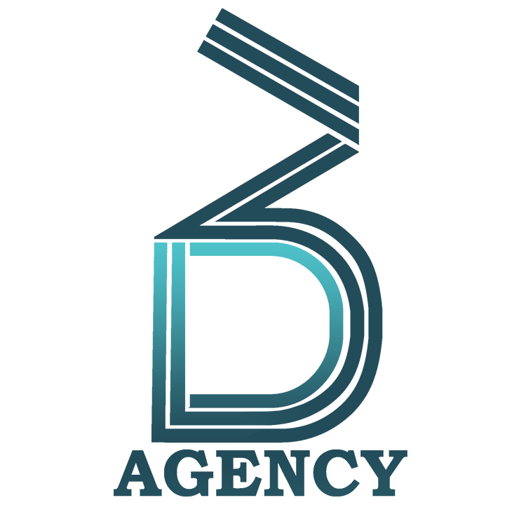
Here is the final logo, created by Kemma, with a few added tweaks by me. These included using a gradient to create a nice flow of gradual colour throughout the logo, highlighting the different characters in the logo effectively.
Website Design
To start the web design process, I started off by looking for some inspiration. I was looking for websites that were clearly laid out and stylish at the same time.
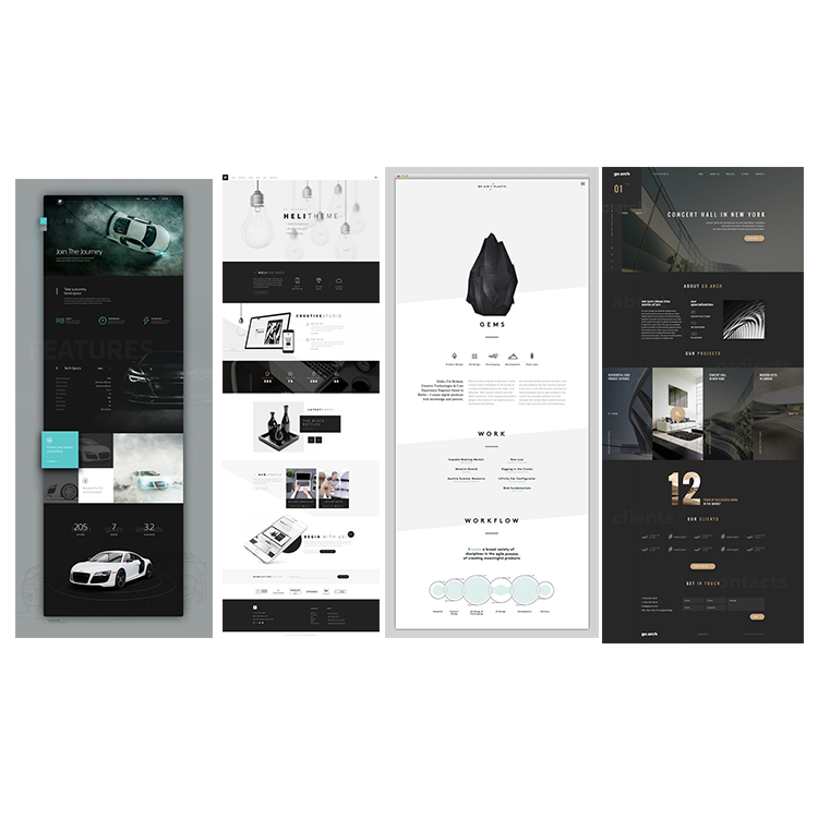
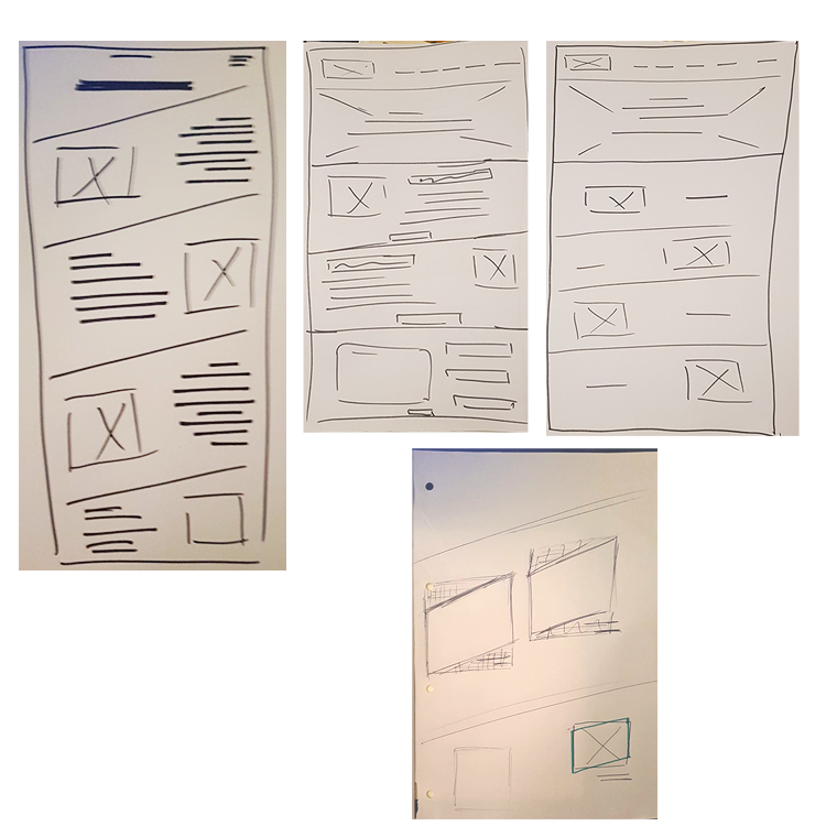
Once we had found some suitable logos on Pinterest, we then moved on to looking at the designs of other websites. The above images greatly inspired our sketches and layout plans for the design of the web site. We especially liked the Audi website’s use of a cyan blue accent colour to complement other elements on the page, such as the imagery of the cars. The We Aren’t Plastic website in the third image influenced greatly on the design structure. From here we started to wireframe our own interpretations of what the website layout will look like and how images and text will be displayed. View below.
Brand Guidelines
Here is a copy of the brand guidelines, designed and formulated by Kemma.
Web Prototype
Please find below the working web prototype for the 3D Agency website, designed by myself with the help of Kemma. If it doesn't work, click here to access it.